Unfinished coloring pages are often treated as a simple finish-rate problem, but that misses the more useful question.
A more useful signal is where progress stops. A page can lose momentum in a dense center cluster, on tiny border details,
during repeated background cleanup, or in the last stretch where visible reward drops and precision demand rises. That is why
a drop-off map is more useful than a generic “people did not finish” label.
The goal is not to frame abandonment as failure. People stop for ordinary reasons: time, fatigue, interruptions, changing mood,
or the simple fact that a page already feels “done enough.” Still, when the same zone type keeps appearing across unfinished sessions,
creators learn something useful. The page is showing where effort starts to outweigh payoff.
Focus: layout friction, not user blame
Includes: zone map, tool patterns, design lessons, FAQ
after the most satisfying visual reward has already happened. That often means dense center clutter, repeated small edge zones,
or late-stage background fill that adds time without changing the page very much.
Why drop-off zones matter more than raw finish counts
A finish rate can tell you whether one page tends to be completed more often than another. It cannot tell you why. Drop-off zones get closer
to the design problem itself. If users repeatedly leave after the hero object is colored but before the border icons begin, the issue is not the same as
a page that loses people halfway through a crowded central mandala. One page is suffering from late-stage cleanup drag. The other is creating friction
too early, before the user has built momentum.
This is especially useful for printable creators, KDP publishers, education publishers, and teachers selecting pages for real sessions. A page can be
attractive in thumbnail form and still create a poor working rhythm on paper. People do not experience a coloring page as a flat image. They experience
it as a sequence: entry, early reward, middle effort, and the choice to keep going or stop. A drop-off map captures that sequence.
The design mistake begins when the page produces avoidable friction in the same place again and again.
How a drop-off zone should be defined
Honest measurement starts with a simple rule: record the last meaningful area completed, not just the last mark placed. Tiny stray strokes,
test marks, or edge corrections do not tell you where the page truly stalled. A better question is where progress stopped feeling worth continuing.
A practical coding model usually needs four pieces of information. First, log the progress stage at abandonment: early entry, mid-page build,
late clean-up, or near-finish stopping. Second, tag the zone type: focal object, dense center cluster, tiny edge detail, repeated mini-cell,
or background fill. Third, log the tool used, because crayons, pencils, markers, and fine liners change friction in very different ways.
Fourth, separate the use context when possible: child home use, classroom use, teen leisure, or adult hobby sessions.
the tool in hand, and whether the stop was voluntary, interrupted, or fatigue-driven when that information is available.
Do not mix “paused and resumed later” with “stopped and abandoned” in the same bucket.
The other important rule is to avoid universal percentages copied from another catalog. Drop-off patterns are highly sensitive to page style,
audience, available tools, and session length. The transferable insight is the shape of the friction, not a borrowed number applied to every printable library.
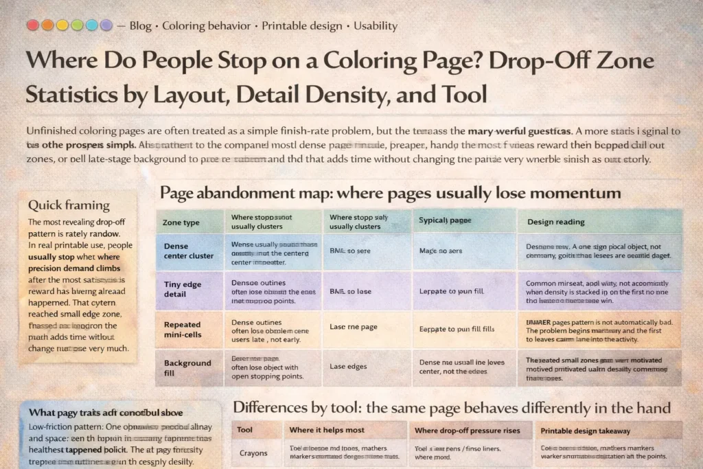
Page abandonment map: where pages usually lose momentum
| Zone type | Where stopping usually clusters | Typical progress stage | Design reading |
|---|---|---|---|
| Dense center cluster | Middle of the page where many small enclosed shapes stack together | Mid-session | The page asks for precision before the user has received enough visible payoff. |
| Tiny edge detail | Borders, corners, decorative rims, hairline accessories, and mini-icons | Mid-to-late | The main subject may already feel complete, so cleanup detail starts to feel optional rather than rewarding. |
| Repeated mini-cells | Pattern pages, color-by-number sections, tiled motifs, repeated petals, scales, bricks | Late mid-page | Novelty drops while hand effort stays high. Repetition drains momentum even when the page is not objectively difficult. |
| Background fill | Large empty regions added after the focal image is already colored | Late-stage | The page may feel visually finished before the actual finish line. The remaining work adds time more than satisfaction. |
| Clear focal object with open stopping points | Stops are more scattered and less zone-specific | Varies | When exits are clean and obvious, non-completion is more likely to reflect context than layout friction. |
Read this map as a pressure model, not as a judgment. The practical goal is to identify which zone repeatedly becomes the first serious stall point.
Patterns by layout and detail density
Simple outlines usually lose users late, not early
Pages with one clear object, readable outlines, and visible stopping points are more forgiving. When people stop, they often stop after the main image is already satisfying.
In other words, drop-off tends to appear in optional background or peripheral cleanup rather than in the heart of the design. That is one reason simple outlines often feel more welcoming:
they provide a quick sense of progress before precision becomes necessary.
Even when the page is not fully completed, the user still leaves with a visible win.
Dense pages often lose people in the center, not at the edges
Highly detailed pages are often assumed to fail because they are “too long.” More precisely, they tend to fail when detail is front-loaded into the part of the page that should provide the strongest early reward.
A crowded middle can create hesitation, slower color decisions, and repeated micro-movements before the page looks noticeably better. That is a poor exchange for many users, especially children and casual adult colorers.
Border clutter creates late-stage drag
Themed pages often work well until the user reaches the decorative extras: stars, leaves, tiny foods, confetti, miniature accessories, frame ornaments, or narrow patterned borders.
These details may help the page look fuller in preview form, but they often behave like low-reward cleanup after the main subject is complete. That is why edge-heavy pages frequently create a drop-off band around the perimeter.
Repeated small zones wear out even motivated users
Repetition deserves its own category because it creates a different kind of friction. A page does not need to be visually dense everywhere to feel tiring. Repeating the same tiny decision dozens of times produces late-session fatigue,
especially with colored pencils, gel pens, or careful marker work. The page is no longer hard in a dramatic way. It becomes monotonous in a quiet one.
Differences by tool: the same page behaves differently in the hand
| Tool | Where it helps most | Where drop-off pressure rises | Printable design takeaway |
|---|---|---|---|
| Crayons | Fast early coverage, forgiving entry, obvious progress for children | Tight corners, thin outlines, repeated tiny edge details | Use broader enclosed shapes and fewer hairline extras when crayons are the likely default tool. |
| Colored pencils | Control, layering, readable mid-size details, calm pacing | Large background fill and long runs of repeated micro-cells | Give pencils a mixed rhythm: one anchor object, one secondary detail band, and a clean stopping point. |
| Markers | Strong early reward, bold contrast, fast page transformation | Tiny enclosed areas where bleed risk or careful edge-tracing slows confidence | Design for larger shapes and intentional white space if markers are part of the expected workflow. |
| Gel pens / fine liners | Accent work, highlights, selective detail, decorative finish | Dense repetition and all-over completion expectations | Use fine tools as an accent path, not as the assumed tool for the entire page. |
Tool choice is why “complexity” should never be treated as a purely visual property. The same page can feel manageable with crayons, tedious with pencils, and risky with broad markers.
A real drop-off analysis always connects the layout to the motor demands created by the tool in use.
What this means for printable design
FAQ
Is stopping early a sign that the page failed?
No. Many unfinished pages still do their job well. A page becomes a design problem only when the same type of friction repeatedly appears in the same zone across many sessions.
What is the most useful drop-off metric to track?
The most useful metric is usually the first recurring stall zone: the area where users most often stop making meaningful progress. That reveals friction more clearly than a single overall finish percentage.
Do dense pages always create higher abandonment?
Not always. Dense pages can work when they still provide a readable entry path, visible reward early on, and logical stopping points. The bigger issue is where density sits, not just how much of it exists.
Why does tool choice change the drop-off zone?
Because tools change the motor cost of the same area. A border that feels manageable with a sharp pencil may feel tedious with a crayon and stressful with a broad marker. Layout and tool have to be read together.
How do you measure drop-off honestly for a printable catalog?
Pre-code page zones, log the last meaningful completed area, separate pauses from true abandonment, record tool and use context, and review patterns across comparable page types rather than mixing everything into one pool.