The first move matters because it reveals friction, not just preference. A page can be attractive in theory and still sit untouched for twenty seconds because the entry point feels unclear, the detail looks too dense, or the first decision asks for too much confidence. That is why start latency is a useful behavioral metric for printable design: it captures the gap between “I picked this” and “I actually began.”
This is not proof of motivation, talent, or mood. It is a practical design signal. Fast starts usually mean the page offers a readable first move. Slow starts often mean the page asks the user to organize too much before the pencil touches paper. For creators, teachers, and families, that distinction is more useful than vague claims about what people “like.”
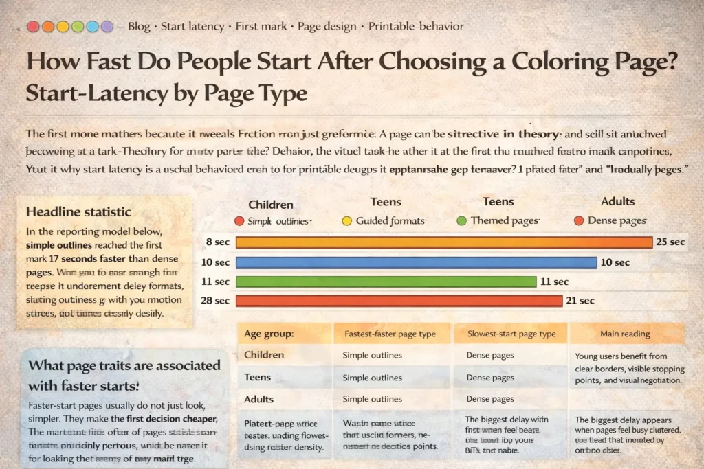
Focus: simple outlines vs themed vs dense vs guided
Includes: chart, methods note, design takeaway, FAQ
Why start latency matters
Completion gets most of the attention, but start behavior often tells the more actionable story. When someone chooses a page and then pauses, the delay can reflect visual overload, uncertainty about where to begin, fear of ruining the page, age-tone mismatch, or simple mismatch between the page and the moment. A fast start does not guarantee completion, but it usually indicates that the first step felt available.
That makes start latency especially useful for low-pressure printables. Teachers need materials that work during entry routines and transition minutes. Parents need pages that do not turn into another negotiation. Creators need to understand why one design gets an immediate pencil mark while another gets admired, set aside, and forgotten. The first mark is small, but it is measurable, comparable, and close to the real design question: how much work does the page ask for before the activity even starts?
Methods note
For this article, start latency means the time from final page selection to the first visible mark on paper. The timer begins after the page is chosen and physically ready to use, not while a printer is warming up or pencils are being located. The timer stops on the first deliberate stroke, dot, outline trace, or color fill that clearly starts the activity.
The page-type comparison below should be read as a benchmark model. Public research strongly supports the direction of the effect: greater choice complexity and higher visual complexity tend to increase cognitive load and hesitation, while simpler visual structures can support faster engagement. But public literature does not currently offer one shared cross-platform benchmark for coloring-page start latency specifically. So the numbers below should be read as a structured reporting example for this metric, not as a universal market average.
- Use the same measuring rule for every session.
- Separate children, teens, and adults instead of merging them.
- Compare page types shown in the same context, not across different room conditions.
- Exclude obvious setup delays such as missing pencils, printer jams, or interruptions before the page is ready.
Segmentation chart: median time from selection to first mark
The pattern is consistent: simple outlines start fastest, guided formats reduce blank-page hesitation, familiar themed pages sit in the middle, and dense pages create the longest pause before the first stroke.
| Age group | Fastest-start page type | Slowest-start page type | Main reading |
|---|---|---|---|
| Children | Simple outlines | Dense pages | Young users benefit from clear borders, visible stopping points, and less visual negotiation. |
| Teens | Simple outlines | Dense pages | The biggest delay appears when pages feel busy, cluttered, or too young for the user. |
| Adults | Simple outlines | Dense pages | Adults often want visual beauty, but still start faster when the first step is immediately readable. |
Design traits linked to faster first marks
- Clear outer structure. The user sees the main shape immediately rather than hunting through many small fragments.
- Obvious entry zone. A large central form, bold border, or guided starting area reduces planning delay.
- Limited early decisions. Fewer equally important regions means less hesitation before the first stroke.
- Familiar theme. Recognizable subjects reduce interpretation time and help the user orient quickly.
- Guided cueing. Color-by-number, pattern prompts, or starter zones can lower blank-page friction without turning the page into a test.
- Age-respectful tone. Especially for teens and adults, a readable design must also feel socially acceptable to begin.
The important point is that these traits support entry, not just appearance. A dense page can be beautiful and still perform poorly on start latency because beauty alone does not answer the question of where the first mark should go. The faster-start page is usually the one that converts visual attention into action with the fewest extra decisions.
What slows the first mark
Dense pages are slow not because people dislike detail, but because detail changes the opening task. Before the first stroke, the user may already be sorting figure from background, choosing a focal area, planning color order, or trying to avoid a mistake. That planning pause is exactly what start latency detects.
When everything calls for attention at once, the page does not offer a natural first move.
Very small shapes raise the cost of accuracy and can make the first stroke feel risky.
If the eye cannot quickly separate main subject from filler, action tends to stall.
Older users may delay or disengage when a page feels babyish, overly decorative, or socially awkward to use.
That is why start latency should not be reduced to a simple “easy vs hard” story. Some users enjoy dense pages once they have already committed. The issue is not whether detail is good or bad. The issue is what detail does to the opening seconds of the experience.
Practical implications for creators and teachers
For creators, the design lesson is straightforward: do not only optimize for how a page looks on a thumbnail. Optimize for how quickly a real person can make the first mark after choosing it. The strongest printable libraries often include at least two usable speeds: fast-start pages for quick entry and stay-long pages for people who want detail after commitment.
Creators: publish the same theme in more than one start profile. A clean outline version and a richer detail version can serve different moments without forcing one page to do everything.
Teachers: use simple outlines or guided formats for arrival time, after-recess reset, substitute folders, and any routine where the page must start quickly.
Parents: when a child stalls, change the page type before giving a motivation speech. The hesitation may be a design mismatch, not resistance.
Teen and adult resources: keep the visual language calm and age-respectful. People start faster when the page feels socially safe to use.
If you want faster starts, do not just reduce detail. Reduce uncertainty about the first move. A page starts quickly when it makes beginning feel obvious, safe, and low-cost.
FAQ: how to measure start latency honestly
What exactly counts as the first mark?
Count the first deliberate visible stroke, dot, trace, or color fill that clearly begins the activity. Do not count repositioning the page, tapping the pencil, or hovering over the sheet.
Should setup time be included?
No. Start timing after the page is selected and ready to use. Printer delay, missing materials, or adult interruptions should be excluded because they measure logistics, not page friction.
How many sessions do you need before the metric means anything?
More is better, but consistency matters most. A small but clean sample with the same rule, same context, and separated age groups is more useful than a larger mixed sample that combines different room conditions and definitions.
Is a slower start always bad?
No. Some dense or highly detailed pages are designed for longer, slower sessions and may still be valuable. A slower start only becomes a problem when the use case requires quick entry, such as classroom transitions, waiting rooms, short breaks, or early routine time.
How do you compare children, teens, and adults fairly?
Keep age groups separate and compare page types within similar contexts. A teen hesitating over a childish-looking page and a preschooler hesitating over a dense page are both real delays, but they reflect different kinds of friction.