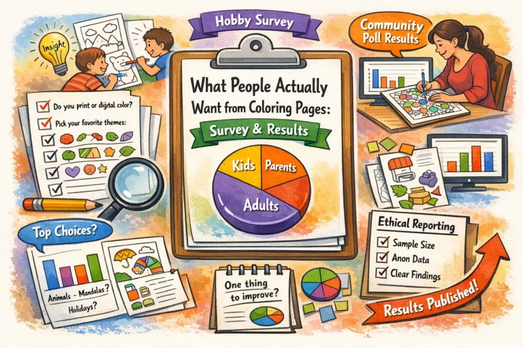
If you publish coloring pages, you’ve probably heard plenty of opinions — “kids want simpler outlines,” “adults want intricate patterns,”
“everyone wants seasonal packs,” and so on. The fastest way to replace guesses with real insight is a small, well-designed
coloring pages survey you can run with your readers, students, or community — and then report as a clean, transparent data story for a blog.
Survey design (sample size, bias, question wording)
A good survey doesn’t need to be huge — it needs to be clear, consistent, and honest about what it can (and can’t) conclude.
Your goal is to learn what people want from coloring pages (themes, complexity, formats, and “deal-breakers”), not to win an argument.
then publish results with a simple methods note so readers can judge the quality.
1) Define exactly who you’re surveying
“People who like coloring pages” is too broad. Decide which group you’ll claim results for, and recruit accordingly:
parents of kids, teachers, adult hobby colorists, or a mixed community.
If you mix groups, build your survey so you can separate them later (for example, by asking a role question in demographics).
2) Add a simple eligibility rule (so answers mean something)
A one-line eligibility rule makes your write-up much stronger. For example:
“Respond if you used, printed, or downloaded coloring pages in the last 90 days.”
This prevents your results from being dominated by people who only clicked out of curiosity.
3) Choose a sample size that matches your publishing plans
For most blogs and classrooms, 100–300 responses can produce a useful “top choices” story and basic cross-tabs. If you treat the survey as a
voluntary community poll (rather than a random sample of the world), you can still publish responsibly by showing
recruitment sources, dates, and exact wording.
As a rough rule of thumb, a simple percentage around 50% has an approximate 95% margin-of-error of: ±10% at n≈100, ±7% at n≈200,
±5% at n≈400, and ±3% at n≈1,000. These figures assume probability sampling; for open-link online polls they’re best viewed as a
precision intuition, not a guarantee. Transparency about who responded is more important than pretending you have perfect representativeness.
Target 100–150 responses. Publish as “community poll” with clear limitations and avoid over-precise claims.
Target 200–400 responses so subgroup sizes aren’t tiny. Avoid cross-tabs with small cell counts.
Target 500+ and document recruitment, eligibility, completion rate, and the exact wording of questions you report.
4) Pilot test before launch (5–10 people)
A short pilot test catches nearly every preventable mistake: confusing wording, missing answer options, and questions that feel too long.
Ask 5–10 people from your target audience to complete the survey and then answer two meta-questions:
“What was unclear?” and “What did we forget?” Fix those issues before you collect real data.
5) Reduce bias before it enters your data
- Recruit beyond your superfans. If you only ask in a fan group, you’ll over-measure “more of the same.”
- Keep incentives gentle. A small raffle is fine; big prizes can attract low-effort clicks and distort answers.
- Limit “select-all-that-apply.” People miss options; consider forced-choice or single “most important” follow-ups.
- Avoid leading language. “Do you love our premium packs?” is not a question — it’s marketing copy.
- Randomize option order (when your platform allows) so the first option doesn’t win by default.
6) Add lightweight quality checks (especially for open-link surveys)
If your survey link is public, basic quality filters protect your analysis without being invasive:
- Speeders: flag completions that finish unrealistically fast (e.g., under 60–90 seconds for 20 questions).
- Duplicate patterns: remove identical responses submitted multiple times in a short window.
- Open-text hygiene: drop entries with gibberish text in multiple fields.
- Optional attention check: a simple “Select ‘Medium’ for this item” question can help with noisy samples.
7) Write questions people can answer accurately
Survey answers are only as good as the wording. Strong questions:
(a) define time frames (“in the last month”), (b) avoid double-barrels (“easy and fun”),
(c) use balanced scales, and (d) separate preference from
behavior (what people say they like vs what they actually download or print).
If “Other” will be common, include it and review the open-text later for new categories.
8) Decide your reporting promise up front
Before launching, write one sentence you will publish with the results. Example:
“This was a voluntary community poll of readers; results reflect respondents, not all coloring page users.”
That sentence keeps your analysis grounded and makes your story more credible.
15 question templates (kids + adults)
Below is a ready-to-run set of hobby survey questions and a lightweight parent survey template for coloring pages.
Each item includes a recommended question type and optional answer options. You can copy these into Google Forms, Typeform, SurveyMonkey,
or a classroom worksheet.
(1) format, (2) complexity, (3) themes, (4) deal-breakers, and (5) “one improvement” open response.
Core questions (work for everyone)
- Relaxation / stress relief
- Entertainment / boredom buster
- Learning (letters, numbers, themes)
- Classroom activity
- Family time
- Therapeutic / mindfulness practice
- Other (short text)
- Print at home
- Color digitally (tablet/phone)
- Both print and digital
- Not sure / depends
- PDF (print-ready)
- PNG/JPG (single image)
- Pack/Bundle (zip or multi-page PDF)
- Coloring-book style (many pages in one file)
- Digital coloring app format (if relevant)
- No preference
- Very simple (big shapes, few details)
- Simple
- Medium
- Detailed
- Very detailed (intricate patterns)
- It depends on the theme
- Under 10 minutes
- 10–20 minutes
- 20–40 minutes
- 40–90 minutes
- 90+ minutes
- Not sure
- Animals
- Nature / landscapes
- Holidays / seasonal
- Fantasy / dragons / unicorns
- Cartoons / cute characters
- Vehicles (cars, trucks, planes)
- Dinosaurs
- Flowers / mandalas
- Patterns / geometric
- Learning pages (letters, numbers, shapes)
- Fairy tales / storybook
- Sports
- Other (short text)
- Lines are too thin / faint
- Too much tiny detail
- Too little detail (feels boring)
- Page is cluttered / hard to read
- Print quality problems (cropping, scaling)
- Watermarks / intrusive branding
- Too many ads or popups around download
- Hard to find what I want
- Other (short text)
Kid-forward questions (answer with a parent/teacher if needed)
- Big shapes that are easy to fill
- Small details that feel like a challenge
- Funny/cute characters
- Animals
- Learning themes (letters/numbers)
- Surprises (hidden objects, mini scenes)
- Not sure / depends
- Too many tiny spaces
- The picture is confusing
- Hard to stay inside the lines
- I don’t like the topic
- It takes too long
- Nothing — I like hard pages
- Not sure
- One big main picture
- Many small objects on one page
- Picture + simple background
- Picture + patterned background
- Mini “scene” (like a story picture)
- No preference
Adult / hobbyist questions (depth, formats, value)
- Quick relaxation (short sessions)
- Mindfulness / calm routine
- Skill-building (blending, shading)
- Creative expression (own palettes, mixed media)
- I mostly download for kids/family
- Other (short text)
- High-quality line art (crisp, consistent)
- Unique themes / original style
- Clear difficulty labeling
- Printer-friendly layout (margins, scaling)
- Many pages per pack
- Calm designs (less clutter)
- Complex designs (intricate detail)
- Bonus extras (palettes, prompts, challenges)
- The newest pages
- Seasonal/holiday pages
- My favorite theme category
- The easiest pages
- The most detailed pages
- Whatever is trending / popular
- I search by a specific topic (optional text: what topic?)
Optional swap-ins (use if they matter for your audience)
If printing issues or art tools strongly affect your users, swap one question (often Q11 or Q9) for one of these.
Keep the total at 15 so completion stays high.
- Paper size: “Which do you print most: A4, Letter, both, or not sure?”
- Tools: “What do you mainly use: crayons, colored pencils, markers, paint, digital brushes?”
- One-sided need: “Do you prefer pages designed for single-sided printing (markers/bleed-through)?”
- Permission: “Do you need classroom/group printing permission?”
Add 5 demographic questions (optional but recommended)
Demographics help you interpret differences without guessing. Keep them optional, avoid collecting direct identifiers, and only ask what you will use.
- Parent/guardian
- Teacher/educator
- Adult hobby colorist
- Therapist / counselor
- Student
- Other
- Under 6
- 6–8
- 9–12
- 13–17
- 18–24
- 25–34
- 35–44
- 45–54
- 55–64
- 65+
- Prefer not to say
- North America
- Europe
- Latin America
- Asia
- Africa
- Oceania
- Prefer not to say
- Daily
- A few times a week
- About once a week
- A few times a month
- Rarely
- This is my first time
- Home printer (inkjet/laser)
- School/office printer
- Print shop
- Tablet app
- Phone app
- Mix of print + digital
- Prefer not to say
How to analyze (top choices, cross-tabs)
You don’t need advanced statistics to publish responsibly. You need a clean workflow that turns raw answers into a clear summary,
plus a few cross-tabs that reveal who wants what — without overclaiming.
Step 1: Clean and label your data
- Apply your quality rules (speeders/duplicates/gibberish) consistently and record how many you removed.
- Define denominators: for each chart, say whether percentages are “of all respondents” or “of those who answered this question.”
- Standardize “Other” text by grouping similar items (e.g., “Pokemon,” “Pokémon,” “Pikachu” → one bucket).
Step 2: Pick chart types that match question types
Show % of respondents per option. Include n and “skip rate” if many people skipped.
Show “% of respondents who selected” each item. Avoid sums that look like 100%.
Publish both “share ranked #1” and “share in top-3.” They answer different questions.
Step 3: Report “top choices” in two useful ways
For questions like Q6 (themes), publish two views:
Top themes by share of respondents (how many people selected each theme) and a “most important” follow-up (one choice).
This prevents a common failure mode: a long select-all list that makes everything look equally popular.
Step 4: Do 3–5 cross-tabs that change decisions
Cross-tabs are where your survey becomes a data story for a blog instead of a list.
Choose cross-tabs that lead to obvious content choices — and keep them simple.
- Role (D1) × complexity (Q4): parents may prefer simpler pages; adult hobbyists may prefer detail; teachers may value clarity.
- Age range (D2) × “too hard” (Q10): which difficulty triggers show up for younger vs older users?
- Print vs digital (Q2) × format (Q3): do digital users actually want PNG/JPG more than PDF?
- Frequency (D4) × time-per-page (Q5): do heavy users tolerate longer pages than occasional users?
- Role (D1) × top priorities (Q14): who values line quality vs printer-friendly layout?
and don’t headline it. If a subgroup is under ~30 total respondents, describe patterns as “directional.”
Step 5: Turn open-ended answers into publishable insight
Your single most valuable question is often Q8 (“change one thing”). A practical coding workflow:
read all answers once, create 6–10 buckets, then code each response into one bucket (or two max).
Publish the top 5 buckets with short, non-identifying example quotes (if you have permission and the quotes are safe).
Step 6: Compare survey answers with your real site behavior
Surveys measure what people say and remember. Your site analytics measure what people do. The strongest publishable insight often comes from comparing:
self-reported choices (Q15) with your top categories page and your most downloaded pages page (names shown here without links).
If users say they choose “most detailed,” but your “quick pages” get the most downloads, that gap is a story — and a product decision.
A ready “methods box” you can publish
Respondents could skip questions. Some items allowed multiple selections. We applied basic quality checks (duplicates/speeders and invalid text).
Results summarize respondents and may not represent all coloring page users. Question wording and answer options are shown in this article (or in an appendix).
| What to report | Why it matters | What it looks like | Common mistake |
|---|---|---|---|
| Recruitment source | Shows who had a chance to respond | “Posted on blog + newsletter + classroom QR” | Presenting it as “what people think” without context |
| Eligibility rule | Prevents “curious clicks” from dominating | “Used/printed in the last 90 days” | Never stating who counts as a user |
| Sample size (n) | Sets precision expectations | “n=243 completed responses” | Only showing percentages |
| Question wording | Wording changes answers | Appendix with Q1–Q15 | Summarizing loosely and changing meaning |
Privacy and transparency notes
Ethical reporting is not just “being nice.” It’s protecting respondents (especially children), keeping data safe,
and letting readers evaluate your methods. If you do these basics, your survey story will feel trustworthy — even if the sample is small.
1) Collect the minimum data you need
- Avoid direct identifiers (full names, emails, exact addresses) unless you truly need them and can secure them.
- Separate incentives from answers: if you run a raffle, collect contact info in a different form so responses stay de-identified.
- Be cautious with free-text: people sometimes type identifying details. Review before publishing quotes or raw rows.
2) If children are involved, design for parent/teacher mediation
For kid-focused surveys, the safest approach is to have a parent/teacher complete the form (or complete it together with the child)
and avoid collecting unnecessary personal information. If your survey is “directed to children” online, you may trigger stricter legal obligations
depending on jurisdiction.
3) Anonymize before publishing any dataset
Publishing a spreadsheet can be risky even if it “doesn’t have names.” Combinations like small location + exact age + rare hobby detail can identify someone.
If you want to share data publicly, aggregate it (theme counts, cross-tab tables) or apply strong anonymization and re-identification review.
4) Transparency: show your work without exposing people
- Publish the survey instrument (Q1–Q15 + demographics) exactly as asked.
- Publish methods (recruitment, dates, n, eligibility, skip rates, and any quality checks).
- Publish limitations in plain language (“voluntary poll,” “mostly readers,” “not a random sample”).
- Avoid causal claims: your survey shows preferences and self-reports, not universal truths.
5) Data retention (a simple policy that helps trust)
If you collect responses, decide how long you’ll keep them. A practical default for small creators is:
keep raw responses for 6–12 months to run follow-up analysis, then delete raw rows and keep only aggregated totals.
If you use a third-party survey platform, mention that the platform stores data on their infrastructure.
Launch checklist (run and publish in about 30 minutes)
-
1) Copy questions into your form tool and mark demographics as optional.
Keep total length tight so completion stays high.
-
2) Paste eligibility + consent at the top of the form.
Example: “Used coloring pages in the last 90 days” + “aggregated public summary.”
-
3) Pilot test with 5–10 people and fix unclear wording.
Ask what felt confusing or missing.
-
4) Recruit from 2–3 places (not only one community).
This reduces single-group bias and strengthens your methods note.
-
5) Publish results as 3 charts + 1 table + a methods box.
Include n, dates, recruitment, and question wording or an appendix.