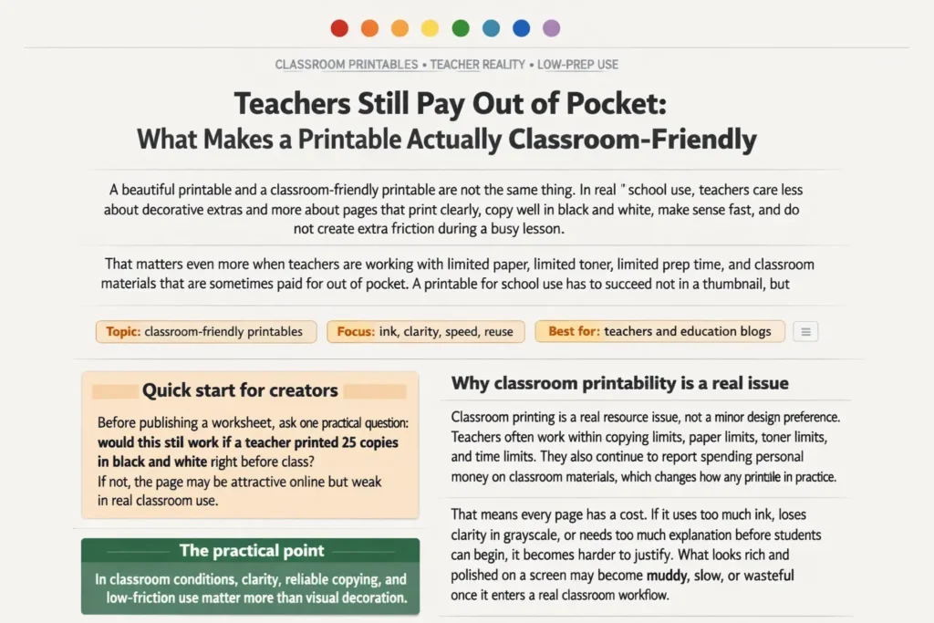
A beautiful printable and a classroom-friendly printable are not the same thing. In real school use,
teachers care less about decorative extras and more about pages that print clearly, copy well in black and white,
make sense fast, and do not create extra friction during a busy lesson.
That matters even more when teachers are working with limited paper, limited toner, limited prep time, and
classroom materials that are sometimes paid for out of pocket. A printable for school use has to succeed not
in a thumbnail, but in a room full of students.
Focus: ink, clarity, speed, reuse
Best for: teachers and education blogs
Includes: comparison table, checklist, FAQ
in black and white right before class? If not, the page may be attractive online but weak in real classroom use.
Why classroom printability is a real issue
Classroom printing is a real resource issue, not a minor design preference. Teachers often work within copying limits,
paper limits, toner limits, and time limits. They also continue to report spending personal money on classroom materials,
which changes how any printable is judged in practice.
That means every page has a cost. If it uses too much ink, loses clarity in grayscale, or needs too much explanation before students can begin, it becomes harder to justify. What looks rich and polished on a screen may become muddy, slow, or
wasteful once it enters a real classroom workflow.
In other words, printability is part of educational usability. A page that fails on the copier, fails under classroom
pressure, or turns the teacher into an interpreter of the worksheet is not truly classroom-friendly.
In classroom conditions, clarity, reliable copying, and low-friction use matter more than visual decoration.
What teachers actually need from a printable
Teachers rarely need a page that looks expensive. They need a page that works. That usually means one clear task,
readable text, enough space for student responses, and instructions that do not need to be translated into a second,
simpler explanation.
A strong classroom printable lowers the teacher’s workload. It helps students start quickly, helps the class stay on track,
and avoids visual clutter that competes with the actual task. When a page is built well, the teacher does not have to rescue it.
Fewer decorative layers, fewer decisions, clearer hierarchy, cleaner black-and-white printing, and one obvious entry point for the student.
Extra banners, themed graphics, heavy shading, novelty labels, decorative fonts, and too many visual accents that make the page look “full” but not easier to use.
Ink, clarity, and speed matter more than decoration
Decorative design elements are often the first thing that break under classroom conditions. Gray backgrounds, thick borders,
layered fills, color-dependent instructions, and dense themed graphics increase ink use and reduce clarity once the page is copied.
Speed matters too. A teacher should be able to print, hand out, and explain the page quickly. A student should be able to see
what to do almost immediately. If the worksheet needs a long orientation before the task begins, the design is working against the classroom.
This is why many effective classroom worksheets feel visually calmer than marketing previews. They use whitespace well, keep the task visible,
and treat decoration as secondary rather than structural.
What makes a page reusable in real classrooms
Reusability is one of the strongest signs that a printable has real classroom value. Teachers return to pages that can work across groups,
centers, early finishers, review blocks, substitute plans, or repeated weekly routines. Reusable does not mean generic. It means dependable.
Pages become more reusable when they have a familiar structure, simple directions, enough space for varied responses, and a task that still
works after multiple uses. A worksheet that only works once because of novelty is usually less useful than a calmer page that works ten times.
Why many pretty printables fail
Many pretty printables fail because they are built for browsing rather than teaching. They are optimized for immediate visual appeal,
not for the way paper moves through a real school day. Once copied, the problems become obvious: weak contrast, too much gray,
cluttered layout, decorative overload, and no strong focal task.
Another reason they fail is that they ask students to decode the page before doing the work. Too many labels, icons, banners, and side elements
split attention. In a large group, that slows the start and increases the amount of teacher direction required.
| Looks nice | Works in class |
|---|---|
| Textured or gray background | Mostly white page with strong line contrast |
| Decorative fonts and playful labels | Simple headings that copy cleanly |
| Many icons and visual accents | One clear task path |
| Meaning depends on color | Meaning survives black-and-white copying |
| Tight layout to fit “more value” | Calm spacing and readable response areas |
| Novelty-heavy one-time design | Structure a teacher can reuse |
A worksheet may not be badly designed. It may simply be designed for the wrong environment: catalog appeal instead of classroom performance.
A checklist before publishing any classroom worksheet
Before calling a page classroom-friendly, it helps to run one last practical test. Teachers experience the page as a copied object moving through
a real room, not as a polished preview on a website.
- Does the page still work clearly in black and white?
- Is the ink load reasonable for class printing?
- Can a student identify the first action quickly?
- Are the directions short, visible, and plain-language?
- Is the layout calm rather than crowded?
- Is there enough space for writing, circling, or coloring?
- Can the worksheet be reused in another lesson or group?
- Would this still feel manageable with 20–30 students at once?
If several answers are no, the page usually needs simplification, not more content. In classroom printables, removing friction is often the real upgrade.
FAQ
What makes a printable classroom-friendly?
A classroom-friendly printable is easy to print, easy to explain, easy to start, and easy to reuse. It works in black and white, avoids unnecessary ink use, and gives students a clear task path without extra decoding.
Why is black-and-white printability so important?
Because many teachers print quickly, copy in bulk, or work under supply limits. If meaning disappears without color, the page becomes less dependable in school use.
Are colorful worksheets always a bad idea?
No. Color is not the problem by itself. The problem starts when the worksheet depends on color, heavy fills, or decorative density to function. A strong page can still be visually pleasant while staying efficient to print and use.
Why do many beautiful printables fail in classrooms?
They often prioritize screen appeal over real classroom workflow. That can lead to low contrast, too much decoration, crowded layout, longer explanation time, and poor copy quality.
What do teachers usually value more: design or usability?
In classroom conditions, usability usually wins. Teachers need pages that support instruction, save time, and work reliably with groups, not just pages that look polished in a preview image.
Can a simple worksheet still feel high-quality?
Yes. Many of the most useful classroom pages are simple on purpose. Clear hierarchy, readable spacing, clean line art, and repeatable structure often signal stronger educational design than decorative overload.
What should creators remove first when improving a classroom page?
Start by removing heavy backgrounds, unnecessary icons, decorative labels, dense side content, and any instruction clutter that delays the first action.