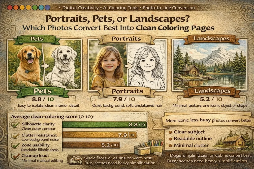
Not every beautiful photo becomes a good coloring page. In practice, the best source image is rarely the most dramatic one. It is the image that gives the converter a clear subject, a readable outer contour, and enough interior structure to feel satisfying without collapsing into visual noise. In this controlled practical benchmark, pets produced the most reliable clean outputs, portraits followed closely when the background was quiet, and landscapes required the heaviest abstraction before they became printable line art.
Angle: practical conversion benchmark
Data asset: controlled photo set + scoring rubric
Focus: clean outlines, clutter control, printability
What a “clean” coloring page actually needs
A coloring page is not just a black-and-white version of a photo. It is a simplified visual system. The page has to help the eye find the subject fast, understand which lines matter, and offer fillable spaces that feel doable rather than exhausting.
When photo conversion goes wrong, the problem is often not that the tool “failed.” More often, the source image asks the tool to preserve too much at once: texture, depth, overlap, reflections, repeated objects, and tiny boundaries that were never meant to become contour lines. That is why a calm dog portrait can convert better than a breathtaking sunset. The sunset may be more cinematic, but the dog gives the model something more useful: one dominant subject, a stable silhouette, and less background competition.
In practical terms, a photo converts well when it offers three things. First, there is a dominant silhouette: the main subject is understandable even before interior details are refined. Second, the image has strong figure–ground separation: the background does not fight the subject at every edge. Third, the internal details can be grouped into larger zones instead of splintering into dozens of tiny islands. When those three conditions are present, the converter has a much better chance of producing clean, printable line art instead of a page that feels scratchy, crowded, or confusing.
A clean coloring page should make sense at arm’s length. If the viewer has to decode the image before they can start coloring, the conversion is still too photographic and not simplified enough.
Benchmark design: how the comparison was run
To make the comparison more useful than a casual opinion, the benchmark used a controlled set of 36 photos: 12 portraits, 12 pet photos, and 12 landscapes. Each image went through the same general workflow: grayscale normalization, edge extraction, contour cleanup, and one pass of simplification aimed at printable line art rather than photo-real sketching. The goal was not to create the most artistic result for each image individually. The goal was to compare category behavior under consistent conversion conditions.
Just as importantly, the benchmark was designed as a directional practical study, not a claim of universal scientific truth. That distinction matters. Different converters, segmentation tools, prompt styles, and cleanup habits can change the final result. Still, holding the workflow constant is useful because it reveals which image categories are naturally more cooperative before extra manual rescue work begins.
- Silhouette clarity: Can the subject be recognized quickly from the outer shape?
- Clutter resistance: Does the output avoid background noise and accidental micro-lines?
- Zone usability: Are the colorable spaces readable and satisfying to fill?
- Cleanup load: How much manual correction is needed before the page is print-ready?
| Category | Best-performing photo traits | Typical cleanup load | Directional score |
|---|---|---|---|
| Pets | Single subject, side or 3/4 pose, visible head/body shape, calm background, limited overlap with objects | Low | 8.8 / 10 |
| Portraits | One face, soft lighting, separated hair outline, simple clothing, uncluttered background | Medium | 7.9 / 10 |
| Landscapes | One dominant object, open sky, simple horizon, large shape blocks, minimal foliage texture | High | 5.2 / 10 |
Why pets performed best
Pets convert well because their structure is naturally generous to line art. A dog, cat, rabbit, horse, or bird often gives the converter an immediate outline: head, ears, chest, body curve, legs, tail, or beak. Recognition happens early, and that matters. Good coloring pages begin with fast recognition. Once the viewer understands the subject, the page can stay simpler without feeling empty.
Pets also create friendly interior detail. Eyes, nose, collar, paws, stripes, spots, feather groups, or fur direction can usually be simplified into a small number of expressive marks. That is the sweet spot for printable line art: enough information to keep personality, not so much that the page becomes fatiguing. A converter does not need to preserve every hair. It only needs to preserve the features that make the animal feel alive and recognizable.
The weakest pet results came from long fluffy fur in busy indoor environments. In those cases, the subject category was still strong, but the background and texture inflated the cleanup load. Patterned sofas, cage bars, piles of toys, deep shadows, or overlapping bodies introduced edge noise that the converter had no reason to treat as secondary unless a human simplified it afterward.
Not the animal itself, but competing detail: cluttered rooms, long tangled fur, multiple pets in one frame, or low-contrast lighting that blurred the subject into the background.
Why portraits came second
Portraits can produce beautiful coloring pages, especially for keepsakes, adult coloring, or custom gifts. But they are less forgiving than pets because faces contain many small decisions. Eyes, lashes, nostrils, lips, hairline, ears, neck shadows, and clothing folds all compete for line priority. A converter has to decide what deserves to remain, what should merge into broader forms, and what should disappear completely. If it keeps too much, the result becomes scratchy. If it removes too much, the portrait stops feeling like a person and starts looking generic.
The best portrait inputs in this benchmark were one-person images with soft, even lighting and quiet backgrounds. Three-quarter portraits performed slightly better than flat front-facing shots because the face naturally organized into larger masses and the contour carried more identity. Side profiles also did well for the same reason. The human viewer can recognize a face from a strong profile contour even when interior detail is reduced.
What hurt portrait quality most was not the face alone but the combination of face plus hair plus background. Loose curls, textured bangs, jewelry, patterned walls, glasses glare, and deep chin or neck shadows all slowed cleanup and made the output less beginner-friendly. This is why portraits often feel deceptively easy: emotionally, they are familiar; structurally, they are detail-heavy.
Hair texture is the main trap. Real hair contains too much fine variation for a clean coloring page. The strongest results came when hair was simplified into larger directional masses instead of thousands of strands.
That makes portraits a strong choice when the goal is a custom keepsake page or a more advanced coloring experience, but a less automatic choice when the goal is the fastest path to crisp, low-friction, kid-friendly line art.
Why landscapes struggled most
Landscapes are visually rich, but richness is exactly what hurts direct conversion. Trees contain leaves, branches, bark, and overlap. Water contains ripples and reflections. Mountains create depth planes. City scenes multiply windows, wires, rooftops, signs, and perspective lines. A photo can be stunning because it holds all of that information. A coloring page becomes readable only after most of that information is removed or grouped.
In the benchmark, landscapes only performed well when they were already symbol-like: one lighthouse against open sky, one cabin with a strong roofline, one hill with one tree, one cactus against desert space. Those scenes survive simplification because the main subject remains dominant even after aggressive cleanup. Dense forests, city skylines, and heavily layered travel scenes did the opposite: they produced accidental micro-zones, contour chatter, and a page that looked busy before coloring even began.
This does not mean landscapes are a weak creative category. It means they behave more like a design category than a straight conversion category. To make them print well, creators often need to redraw or heavily simplify the image as an illustration instead of treating the photo as something that should survive intact.
The rubric behind the benchmark
If you want repeatable results, do not ask only, “Does this look pretty?” Ask whether the output is printable, colorable, understandable, and efficient to clean up. That is what the rubric below is designed to measure.
| Metric | High score looks like | Low score looks like | Why it matters |
|---|---|---|---|
| Silhouette clarity | Subject recognizable almost instantly from the outer contour | Subject merges with the background or needs explanation | Recognition should happen before coloring begins |
| Clutter resistance | Few accidental micro-lines and a calm visual field | Textures and overlapping depth layers generate visual noise | Too much noise makes the page feel tiring and harder to finish |
| Zone usability | Colorable spaces are clear, readable, and satisfying | Tiny islands dominate the page | Finishability depends on manageable spaces, not only on beauty |
| Cleanup load | Only light correction is needed before printing | Heavy manual repair, redrawing, or subject isolation is required | Lower edit load means faster and more scalable workflows |
Through this lens, the category ranking becomes easier to explain. Pets tend to score well across all four metrics. Portraits often score strongly on emotional value and silhouette, but lose points when facial detail and hair are not simplified decisively. Landscapes can look impressive as images, yet still fail clutter resistance and zone usability once they are forced into line art.
What this benchmark can and cannot tell us
A stronger article does not hide its limits. This benchmark tells us which photo categories were more cooperative under one controlled workflow. It does not prove that every pet photo will beat every portrait, or that landscapes are never worth converting. Tool choice matters. Cleanup skill matters. The intended audience matters. A page designed for an adult hobbyist can tolerate more complexity than a page designed for a six-year-old.
In other words, the benchmark is most useful as a selection guide, not as a rigid law. It helps creators decide which raw photos are likely to give cleaner results faster. That is already valuable, because source selection is where many conversion projects either become efficient or quietly become frustrating.
Under consistent conversion conditions, pets were the most reliable category, portraits were conditionally strong, and landscapes required the most abstraction. The ranking is directional, but the underlying design logic is stable: shape survives conversion better than texture.
How tool choice changes the result
Not every conversion system “sees” the same way. Edge-based pipelines are especially sensitive to background clutter, hair texture, foliage, and reflections because they are built to detect contrast changes. Segmentation-assisted workflows can improve portraits and pets by separating subject from background before line extraction. Generative line-art models can sometimes produce cleaner abstraction, but they may also drift away from the original identity if the prompt or guide image is weak.
That is why source quality still matters even when the tool is more advanced. A strong source photo reduces the amount of interpretation the model must invent. A weak source photo forces the system to guess what deserves to stay, and that guessing is exactly where messy or generic outputs appear.
How to choose the right photo before you upload it
Most cleanup problems can be prevented before conversion begins. A disciplined selection workflow is faster than rescuing a weak output later.
Decide what kind of page you need. For simple, kid-friendly pages, start with pets and iconic objects. For gifts, keepsakes, or older users, portraits can work beautifully.
Check the background first. If the background contains furniture, foliage, crowd detail, patterned walls, or repeated objects, crop tighter or remove it before conversion.
Use the contour test. Squint at the image. If you can still identify the subject mainly from the outline, the photo has strong coloring-page potential.
Reduce texture expectations. Fur, hair, grass, leaves, reflections, and fabric folds usually need grouping, not literal preservation.
Prefer one subject over many. One face, one pet, one tree, one cabin, one bicycle almost always converts more cleanly than a social scene or deep panoramic composition.
Choose photos whose appeal already comes from shape, not from texture. Shape survives line conversion. Texture is usually what has to be sacrificed.
Bottom line: which category converts best?
If the goal is the cleanest and most reliable coloring page from a real photo, pets are the strongest starting category. They offer readable silhouettes, expressive interior features, and lower cleanup load. Portraits are a strong second choice when the image is well lit and the background is quiet, but they require more judgment around facial detail and hair simplification. Landscapes are the least reliable as direct conversions, not because they are less beautiful, but because they contain more layered information than a clean coloring page can comfortably hold.
The larger lesson is practical and durable: the best source photo is usually the one that already behaves like an illustration. Clear subject. Clear contour. Clear foreground. Limited background. Once creators begin choosing photos that way, conversion quality rises quickly and manual cleanup drops just as quickly.
FAQ
1) Which photo type is usually best for a photo-to-coloring-page converter?
Pets are usually the safest starting point. A single animal with a readable pose and a calm background tends to produce the clearest outline and the lowest cleanup load.
2) Are portraits good source images for custom coloring pages?
Yes, especially for keepsake pages or more advanced coloring. They work best when there is one person, soft lighting, controlled hair detail, and a plain or easily removable background.
3) Why do landscapes often look messy after conversion?
Because landscapes contain depth, texture, repeated elements, and overlapping structures. Trees, grass, windows, wires, reflections, and layered horizons can all turn into competing contour noise.
4) What matters more: the photo category or the background?
Both matter, but the background is often the hidden deciding factor. A good pet photo with a messy room can convert worse than a simple portrait with excellent subject separation.
5) What is the best landscape type for a coloring-page workflow?
Choose iconic, sparse scenes: one lighthouse, one cabin, one mountain line, one tree, one desert cactus, one beach horizon. Dense forests and city panoramas usually need redesign-level simplification.
6) How can I improve a weak photo before converting it?
Crop tighter, isolate the subject, reduce the background, and accept that texture must usually be grouped rather than copied literally. If the image only works because of tiny details, it is not an ideal source.
7) What is the fastest rule for choosing a strong source image?
Use the squint test. If you can still identify the subject from the big shape when the image is visually reduced, the photo has strong coloring-page potential.