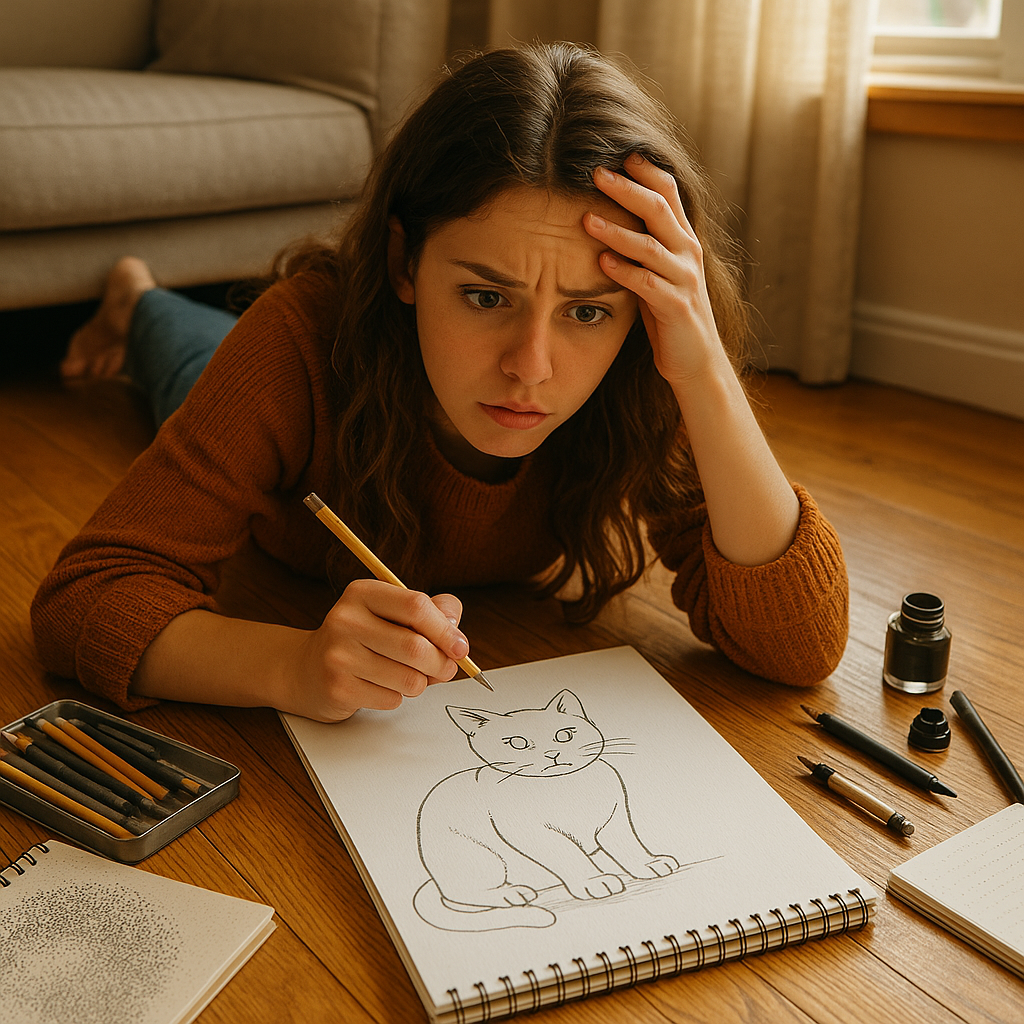
Let me take you back a few years. I was sprawled out on the living room floor in my small Brooklyn apartment, a sketchpad in one hand, a chipped pencil in the other. I’d just finished a line drawing of my neighbor’s cat, and I remember thinking, “This looks flat.” That moment lit a fire in me. I didn’t know much back then, but I realized I needed to understand not just how to draw, but how to bring drawings to life. Enter: shading.
Table of Contents
In the world of art, line drawing and shading are like salt and pepper — different, yet often best when used together. If you’ve ever found yourself wondering whether to stick with crisp outlines or dive into shadows and gradients, you’re not alone. This article is here to clear up the confusion. We’ll dig deep into the essence of both styles, look at real-world examples, and help you figure out exactly when to use each.
Whether you’re sketching for fun, preparing for an architecture portfolio, or illustrating a book, understanding when and how to use line drawing versus shading can take your work from good to gallery-worthy.
What is Line Drawing?
The Core of Line Drawing
At its heart, line drawing is all about simplicity. Think of it as the skeleton of a drawing — clean lines, no frills, just the bare bones that outline shapes, suggest movement, and define edges. It’s where every great sketch begins.
When I first started sketching cityscapes around Central Park, I used line drawing almost exclusively. It was quick, clean, and helped me nail down the structure before worrying about fancy stuff like light and shadow. With just a few strokes, I could capture the rhythm of Manhattan’s skyline or the motion of a jogger whizzing by.
In technical terms, line drawing strips away unnecessary detail. No shading, no color, just lines. It’s often used for blueprints, fashion illustrations, comics, and more. That minimalism? It’s powerful.
Historical Uses and Artistic Evolution
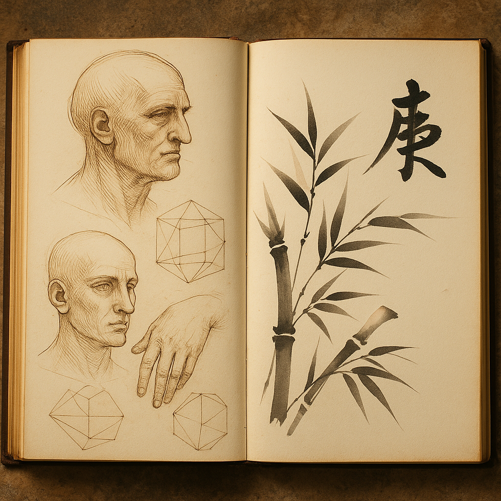
Line art isn’t new. It dates back to ancient cave drawings and Egyptian hieroglyphics. Artists like Leonardo da Vinci used precise lines in their sketches to plan out masterpieces. Fast forward to the 20th century, and line art became central in comic books, animation, and design drafts.
In Japanese sumi-e ink painting, a single brushstroke tells a story. That’s the magic of lines. Here in the U.S., I once attended a workshop in Austin, Texas, where we recreated classic architectural blueprints using nothing but pen and ruler. It was a lesson in discipline and design — and all line work.
Today, line art’s having a bit of a renaissance thanks to digital illustration. It’s crisp, versatile, and works wonders on everything from logos to tattoos.
Types of Line Work (Contour, Gesture, Cross Contour, etc.)
Let’s break down a few types of line drawings you’ll encounter:
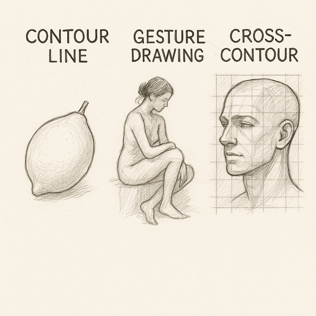
- Contour Lines: These define the edges of a subject. Think of drawing your hand without lifting your pen — that’s contour.
- Gesture Lines: Loose, fast lines that capture movement. Ideal for drawing people in motion — like dancers or athletes.
- Cross Contour: Lines that go across the surface of a form to show depth. It’s like wrapping a wire around a sculpture.
Each style brings something different to the table. I remember once sketching a jazz band in New Orleans using gesture lines — the way those lines danced across the page captured the energy better than a photo ever could.
What is Shading?
The Purpose of Shading in Art
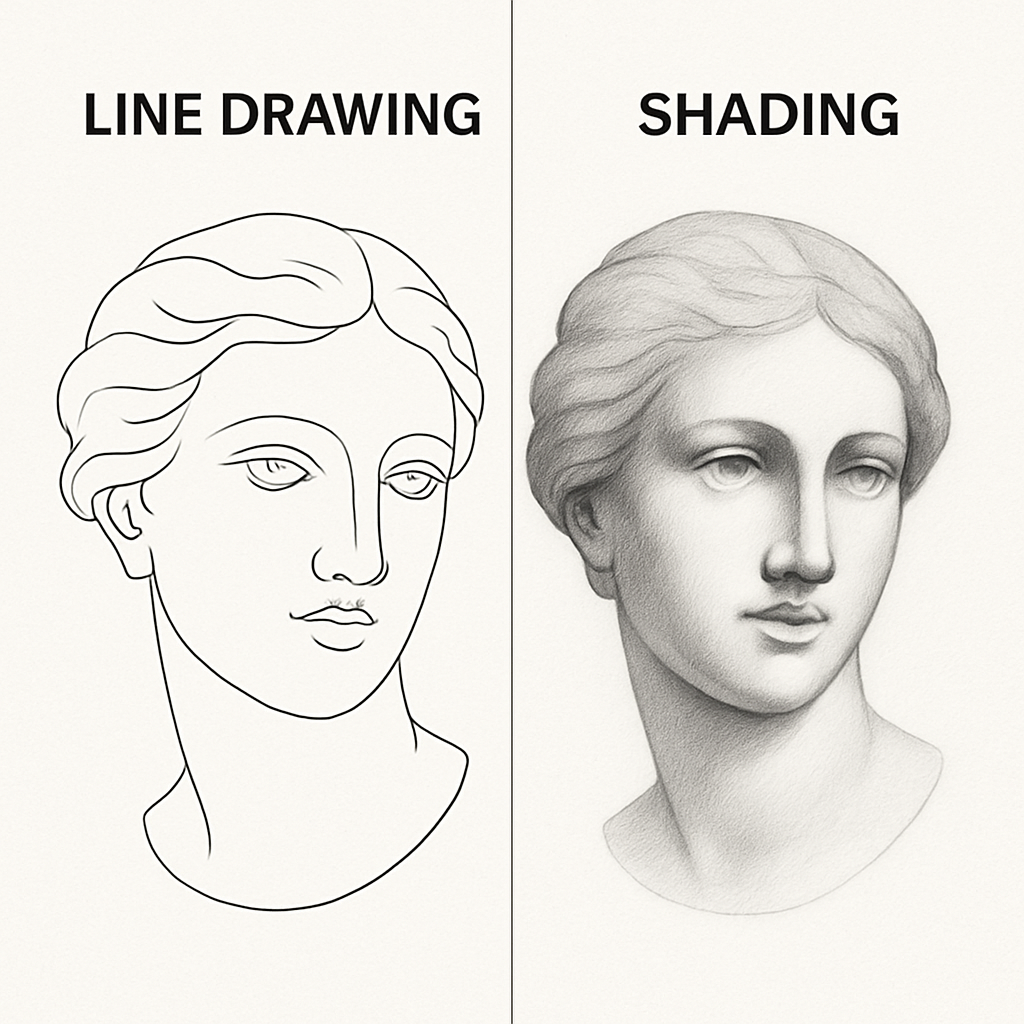
Now, shading? That’s the soul of a drawing. It’s how you show dimension, mood, and light. Without it, your sketches might look flat — like mine did back when I was still stuck with lines.
Shading helps your subject pop off the page. It’s how you turn a simple circle into a sphere or give your portrait the illusion of cheekbones. With shading, you introduce highlights, shadows, and mid-tones — a full range of values that mimic real life.
A few winters ago, I took a trip to the Rockies and sketched a snow-covered cabin. Line work captured the structure, but shading brought out the shadows under the eaves, the soft gradient of snow on the roof, and the way the morning light hit the trees. It was a whole different vibe.
Shading Techniques (Hatching, Cross-Hatching, Blending, Stippling)
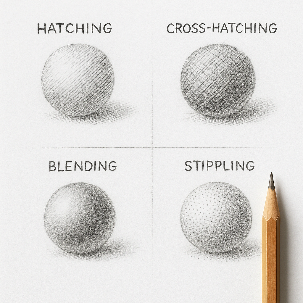
Let’s get into the nitty-gritty:
- Hatching: Parallel lines that build tone. Closer lines mean darker areas.
- Cross-Hatching: Overlapping sets of hatching for richer shading.
- Blending: Smooth transitions using tools like blending stumps, tissues, or even your finger.
- Stippling: Tiny dots. It takes patience, but it’s stunning when done right.
Each method offers different textures. Want something crisp? Try hatching. Going for a soft, dreamy effect? Blending is your best bet. I once did a stippled portrait of my dog for a local gallery show in Denver — took forever, but man, the results were worth it.
Key Differences Between Line Drawing and Shading
Visual Impact and Viewer Experience
If you’ve ever compared a comic strip to a fine art portrait, you’ve probably felt the difference instantly — that’s the impact line drawing and shading create. Line drawings are sharp, defined, and clear. They guide the eye in a deliberate, structured way. They say, “Here’s what I’m showing you.” Shading, on the other hand, whispers. It draws you in subtly, building emotion and nuance. It says, “Feel this.”
I remember presenting two sketches at a local art event in Asheville, North Carolina. One was a line drawing of a historic building, the other was the same scene but with full shading. Most folks admired the line version for its clarity, but it was the shaded piece that got people leaning in and asking, “What time of day is this? What’s the mood?”
Functional Differences in Art Practice
Functionally, line drawing is often about precision and planning. It’s common in engineering blueprints, product design, and comic book layouts. It’s clean, quick, and translates well across media. I used it heavily when freelancing for a tattoo parlor in Miami — lines are essential in tattoo stencils, after all.
Shading? That’s for when you’re aiming to evoke. It’s used to create depth and realism — great for portraits, landscapes, or anything emotional. In a mural project I participated in downtown Phoenix, we used both: outlines for form, shading for vibe. And trust me, that combo hit hard.
How the Artist Approaches Each
Line drawing often starts with confidence. You train yourself to make deliberate, accurate marks. There’s less room for fluff. Shading, though, allows more forgiveness. You can build gradually, adjust with an eraser, and massage your drawing into life.
Personally, I treat line drawing like outlining a map. Everything has its place. Shading? That’s the terrain, the atmosphere. It’s how I add wind to trees, warmth to skin, and silence to shadows.
When to Use Line Drawing
Illustrating Architectural Concepts
Architecture thrives on clarity, and line drawing is perfect for that. Whether you’re drafting a cabin or a high-rise, clean lines define structure, proportion, and scale. During a semester abroad in Copenhagen, I visited studios where even napkin sketches looked like blueprints. Every window, doorway, and beam was mapped out with line precision.
Line drawing’s biggest strength here is in its communicative clarity. There’s no guesswork. Architects use lines to convey exact details — from foundation depth to window alignment. Even city building departments (like in San Francisco, where I briefly worked with a local firm) require line drawings in submissions. They’re a universal visual language.
Fashion Design and Technical Illustration
Walk into any fashion school — from Parsons to FIDM — and you’ll see sketchbooks brimming with line drawings. That’s because clothing design is all about form. Line work shows how fabric drapes, how seams sit, and how a silhouette flows.
Technical illustration in fashion demands accuracy. You need to show cuffs, pleats, collars — all with clarity. I once collaborated with a local designer in Chicago who preferred no shading at all. Why? “Because I need to see the garment, not the mood,” she said.
Personal Sketchbooks and Daily Practice
Line drawing is perfect for daily doodles or keeping a visual journal. No need to fuss with shadows — just capture a quick moment, like the corner cafe in Seattle where I often sit and sketch passersby. The beauty of line work is its portability and speed. One pen, one sketchpad, and you’re set.
If you’re just starting out or trying to build consistency, commit to a “line-a-day” challenge. Sketch anything — a spoon, a sneaker, your dog — using just lines. It sharpens your observation and trains your hand to follow form.
When to Use Shading
Portraits and Realism
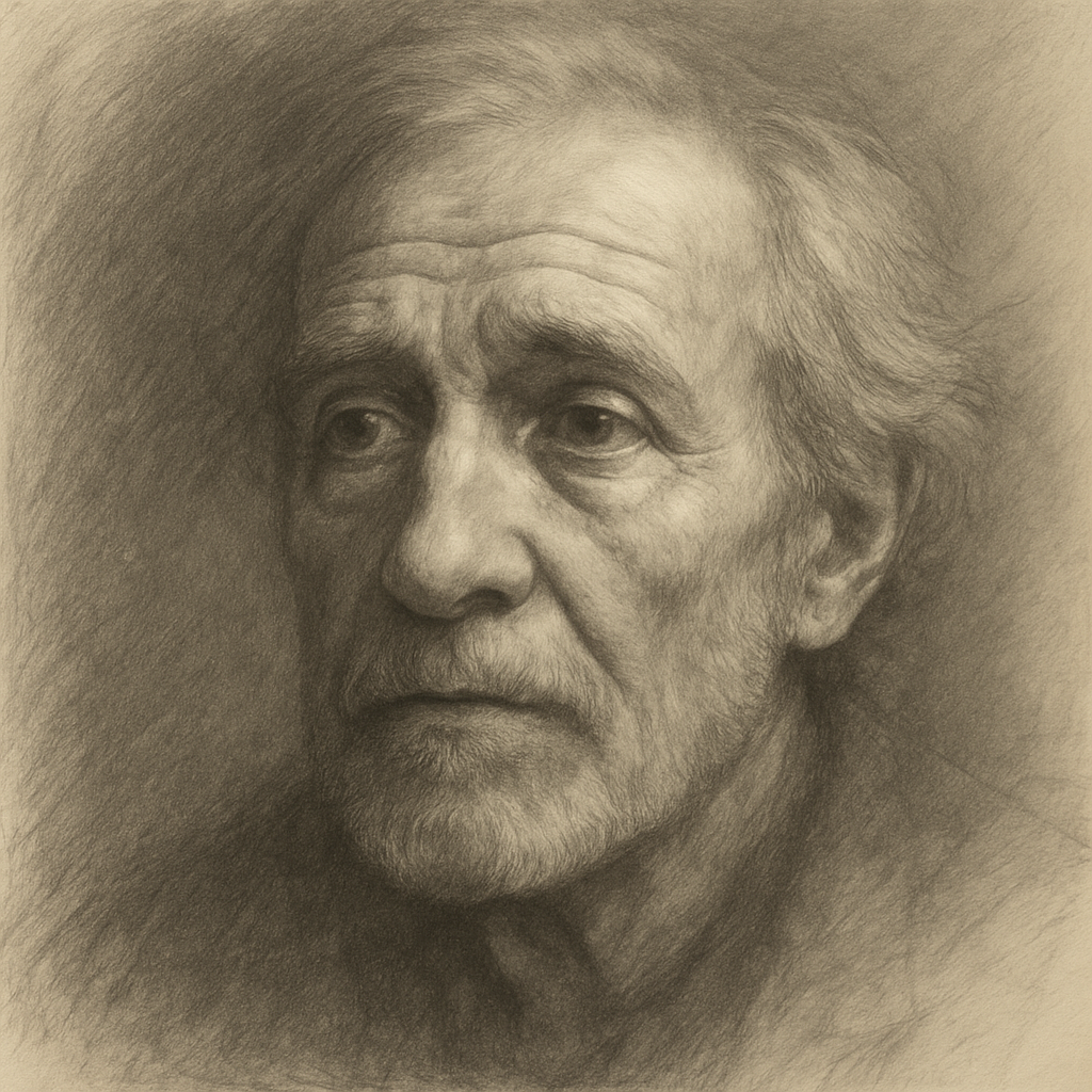
Want to capture your friend’s smile or the glint in your grandma’s eyes? You need shading. Line work can’t carry the emotional weight or subtlety of facial contours. Shading adds muscle, texture, and soul.
I once did a portrait of my late uncle using only graphite and shading techniques. No outlines. Just light and dark. It now hangs in my mom’s living room in St. Paul, Minnesota, and every time someone visits, they pause and say, “Wow, it looks like he’s about to speak.”
Shading is crucial in realism — it mimics how light dances across skin, how shadows sit in eye sockets, and how wrinkles suggest a life well-lived.
Creating Depth in Landscapes
If line drawing builds the bones, shading creates the breath of a landscape. It adds layers, separates foreground from background, and emphasizes perspective. I’ve done plein air sketches all over the Blue Ridge Mountains, and let me tell you — no line can capture mist rolling over hills the way a soft gradient can.
Shading lets you indicate time of day, season, and even weather. Want to show a humid summer evening? Go heavy on the darks and soft on the transitions. A crisp winter morning? Use stark contrast and sharp edges.
Light and Mood Manipulation
Shading is emotional. You can tell a story through your use of light and dark. I once drew a moody New York alleyway using only charcoal — the deep shadows did most of the storytelling. No need for figures or signs. The vibe was enough.
Artists use shading to steer the viewer’s eye, create focal points, and suggest atmosphere. Want a drawing that feels cozy? Use gentle midtones. Something eerie? High contrast with jagged shadows. You’re not just drawing — you’re painting with light.
Combining Line Drawing and Shading
Hybrid Techniques in Modern Art
Some of the most compelling works out there blend the two. A bold line frame paired with soft shading inside can be mesmerizing. Think graphic novels, editorial illustrations, or digital concept art. One artist I met at a gallery in Santa Fe layered thick pen lines with delicate graphite shading — the effect was both gritty and elegant.
Hybrid art techniques give you flexibility. You can define structure with lines, then add emotional weight with shading. This works great for dynamic compositions — characters, architecture, fantasy scenes, you name it.
How Mixed Methods Enhance Storytelling
Imagine illustrating a storybook page: a little boy in the forest. You might use line drawing to outline the trees and his figure, then shade the background to suggest evening light filtering through leaves. It’s storytelling in layers.
In my freelance illustration work, I often use lines to establish the narrative and shading to create emotional context. For instance, in a children’s book I helped design for a publisher in Austin, TX, I used crisp lines for playful animals and soft shading for the cozy environment they lived in.
A Local Artist’s Take from Portland, Oregon
I interviewed Kelly, a mixed-media artist from Portland, who combines Micron pens with graphite powder. “Lines tell you where to look,” she said, “but shading tells you what to feel.” Her pieces often feature Pacific Northwest themes — pine forests, foggy coastlines — and the blend of line and shadow makes them hauntingly beautiful.
Common Mistakes and How to Avoid Them
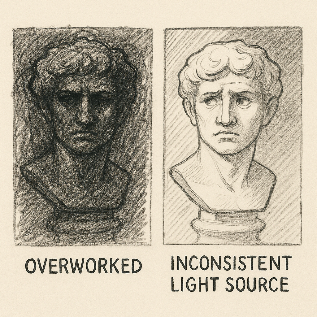
Overworking Your Sketch
We’ve all been there. You start a drawing, it’s going well, but you just. Keep. Adding. Soon, your crisp linework is buried, or your shading turns into a murky mess. Overworking can flatten your piece and tire your hand. One trick I learned from a mentor in Kansas City: Set a timer. Thirty minutes, then walk away.
Sometimes less is more. Know when to stop. Let your drawing breathe.
Ignoring Light Source Consistency
Inconsistent lighting is a rookie mistake — one I’ve made plenty. If your shadows fall in different directions, your drawing will look off, no matter how good your technique is. Always decide on your light source first. I like to mark a tiny sun icon in the corner of my page to remind me.
Whether you’re shading a still life or sketching a building, lighting consistency anchors your work in realism.
Using the Wrong Materials
Your tools are your allies. Don’t expect professional results with dollar-store supplies. That doesn’t mean you need to drop $100 on pencils, but quality matters. I once tried doing a full shaded drawing on printer paper during a layover in Atlanta — it buckled under pressure (literally).
Invest in a good set of sketching pencils (HB to 6B), a kneaded eraser, and quality paper. Your art — and your confidence — will thank you.
How to Choose the Right Technique for Your Project
Ask the Right Questions Before Starting
Before you even touch your pencil, take a moment to ask yourself a few key questions:
- What’s the goal of this piece?
- Who’s it for?
- Do I want realism or expression?
Let me give you an example. I once had a commission for a pet portrait from a family in Savannah, Georgia. They wanted a fun, stylized image to hang in their kitchen. I leaned into bold lines and only a touch of shading — playful and simple. But for a separate commission of a memorial portrait in Richmond, Virginia, I went full graphite shading, down to the glint in the dog’s eye. Each piece needed a completely different approach.
Knowing your purpose helps you pick the right path: line for clarity, shading for emotion.
Medium and Time Constraints
Sometimes, it’s not about artistic choice — it’s about practicality. If you’re on a tight deadline or working digitally, line art might be your savior. It’s faster, easier to edit, and translates well across media.
I worked a gig in Minneapolis where I had to produce 10 character sketches for a game in under a week. I stuck with clean line drawings, added minimal shading, and delivered on time. If I’d gone full graphite realism, I’d still be drawing.
On the flip side, if the client wants richness and you have the luxury of time? Go for shading. It’s worth it.
A Real-World Case Study: Illustrating a Children’s Book
Line Art for Playfulness
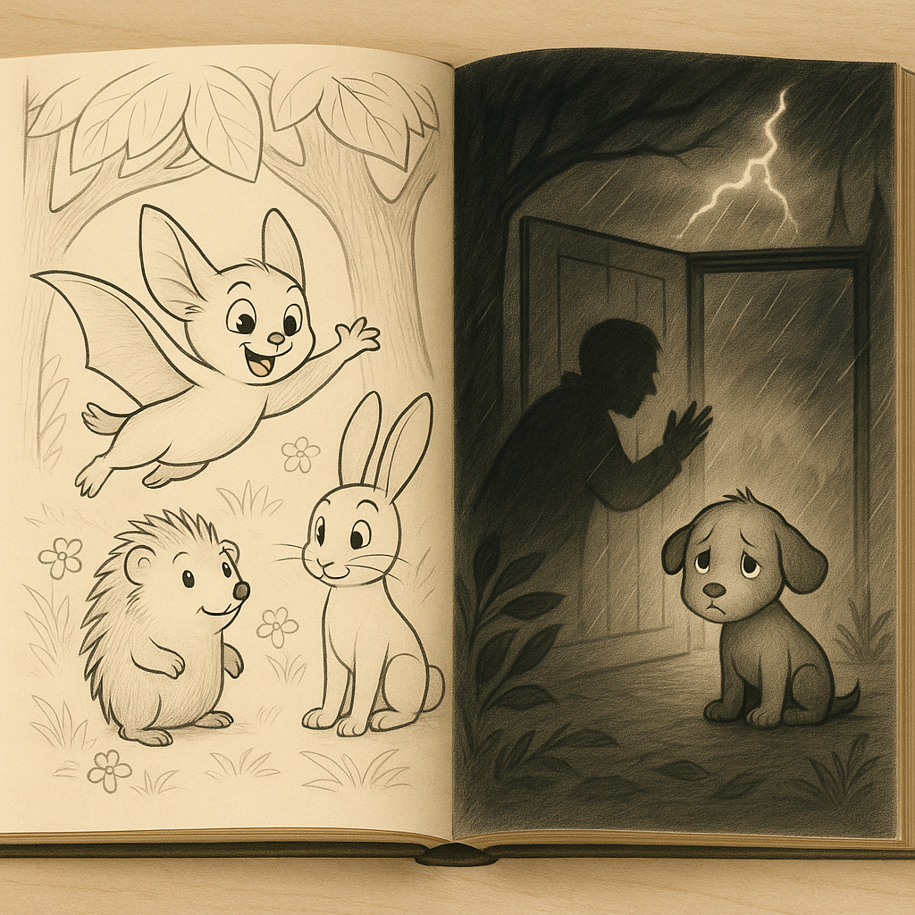
A couple of years ago, I got a chance to illustrate a children’s book written by a schoolteacher from Vermont. The story was whimsical, about a flying squirrel and his forest friends. She wanted it light, fun, and “not too serious.” So I leaned into line art — clear outlines, big expressions, minimal distractions.
Kids connect better with visuals that are clean and expressive. Line art lets them focus on character shapes and actions. Plus, it reproduces well in black and white, which is helpful for low-cost printing — especially important in school distribution or self-publishing.
I remember testing early drafts with a class of third graders. They loved tracing the characters and coloring them in — something they couldn’t do if I’d shaded everything in graphite.
Shading for Emotional Depth
But the book wasn’t all fun and games. There were scenes with storms, moments of fear, and even a sad goodbye. That’s where I switched gears and added strategic shading. A stormy sky was rendered with hatching; the sad goodbye used soft blending to create a melancholic mood.
Those scenes stood out. Kids noticed. One even told me it “felt like the squirrel was really sad.” Mission accomplished.
Using both techniques in the same book gave it range. The line art kept things light; the shading added depth when needed.
Practice Makes Perfect: Building a Sketch Routine
30-Day Challenge: Line Drawing Focus
Want to get good fast? Do a 30-day line drawing challenge. Pick a theme — faces, objects, buildings — and sketch one every day. No shading, just lines. It trains your eye to see form and your hand to follow it.
I did a “Daily Object” challenge during a rainy March in Seattle. Every day, I drew something around the house: a spoon, a shoe, a lamp. By week three, my lines were cleaner, and I could sketch in half the time.
Weekly Shading Exercises
Once you’re comfy with line work, add weekly shading drills. Try:
- Drawing spheres with different light sources
- Sketching fabric folds
- Shading fruit and vegetables from life
Dedicate one sketch session per week just to shading. Use a single pencil and see how far you can push value range.
Combining Both in Daily Journals
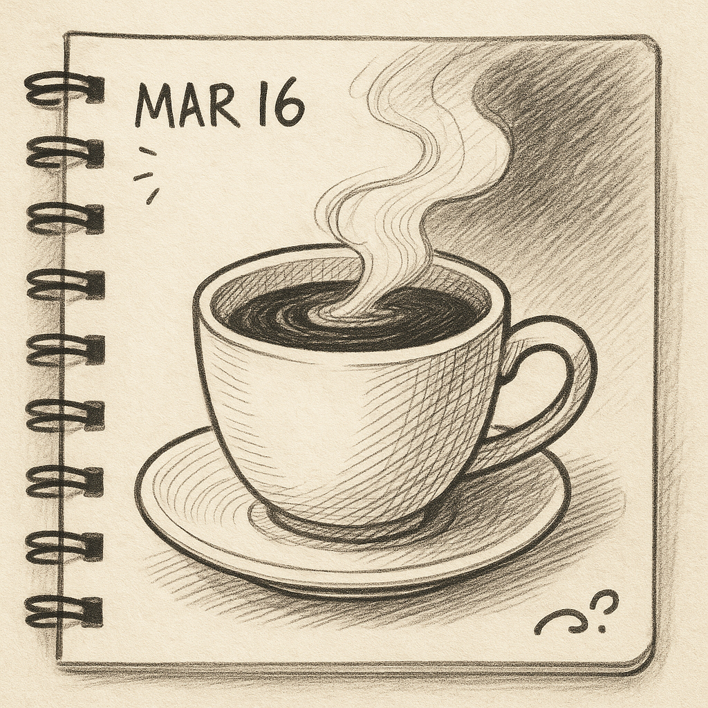
One of my favorite habits is keeping a visual journal. Each page has a line sketch and shaded element. It helps me stay balanced, lets me experiment, and preserves memories.
I’ll sketch my morning coffee in pen, then shade the steam with soft graphite. Or outline a street scene and shade the shadows. These journals become a personal archive — part art practice, part diary.
Final Thoughts
Line drawing and shading aren’t competing forces — they’re complementary tools in every artist’s toolkit. Line gives you structure, clarity, and speed. Shading adds depth, emotion, and realism. Knowing when to use each (or both!) is what sets a great sketch apart from a good one.
So next time you sit down with your sketchpad, ask yourself: Do I need to explain… or do I want them to feel? The answer will lead your pencil.
Whether you’re sketching cityscapes, designing characters, or just doodling in a cafe — embrace both techniques. Let lines define, and let shadows speak.
Keep drawing. Keep exploring. And most importantly — have fun with it.