The best printer friendly coloring pages are not the ones that look the most dramatic in a website preview. They are the ones that print clearly on an ordinary home printer, on plain paper, without wasting ink or forcing parents to fight with settings. In real family use, that usually means a page with clean black outlines, comfortable margins, and no unnecessary dark fills. Parents may enjoy attractive design, but at home they usually choose the printable that feels dependable, readable, and inexpensive to print more than once.
Focus: home printing practicality
Includes: ink use, line clarity, margins, scaling
Angle: what parents actually prefer at home
Why home printing changes what “good design” means
A parent printing at home is not evaluating a coloring page the way a designer or illustrator might. They are looking for something that works immediately: clear lines, no cropped edges, no muddy dark areas, and no feeling that one simple activity just cost too much ink.
That is why print usability matters so much. A page can look stylish on screen and still create friction in the real moment of use. At home, many families print from basic inkjet printers, older wireless models, mobile apps, built-in browser dialogs, or default PDF settings they rarely adjust. The printable has to survive those everyday conditions. If it needs perfect settings to look right, it is not truly parent-friendly.
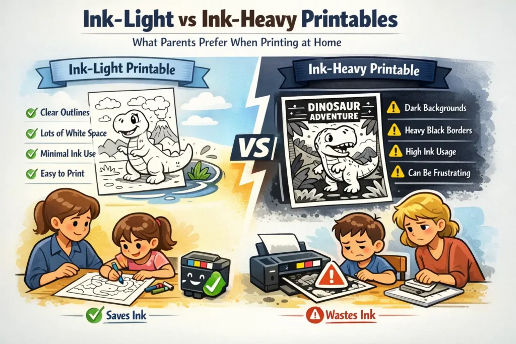
This is the key difference between on-screen appeal and home-print practicality. A dramatic dark header, shaded background, or thick decorative frame may help a preview image look polished. But when that same design reaches a kitchen-table printer, it can turn into extra cartridge use, slower output, or a page that feels heavier and less clean than parents expected.
What ink-light and ink-heavy really mean in a printable
In this context, ink-light does not mean plain or unfinished. It means the printable uses ink where it improves the child’s experience and avoids using it where it only adds visual weight. An ink-light page can still feel thoughtful, attractive, and complete. It simply stays disciplined.
Clear black outlines, open white space, restrained top elements, and enough margin around the working area. These pages usually feel faster, cleaner, and more predictable on ordinary home printers.
Thick banners, dark frames, shaded backgrounds, decorative black fills, or layout elements that consume ink before the child even starts coloring. These may look richer in previews, but at home they often create unnecessary print cost and more chances for disappointment.
The important point is that this article is not using detail level as the main lens. A page can be imaginative, full of objects, and engaging to color while still being printer-friendly. The issue is not whether the composition is simple or busy. The issue is whether the printable prints efficiently and stays easy to use.
Why parents usually prefer ink-light pages for everyday use
Most home printing happens in ordinary, slightly rushed situations: before dinner, before school pickup, on a rainy afternoon, before a road trip, or while trying to occupy more than one child at once. In those moments, parents tend to prefer pages that feel reliable rather than visually heavy.
- They use less ink on non-essential areas. Parents usually do not want to spend ink on dark page furniture when the child’s coloring will provide the visual richness anyway.
- They keep outlines readable. Clean black lines survive better on average settings than pale grays, textured fills, or decorative shading.
- They reduce failed prints. A simpler print structure gives the page a better chance of coming out usable the first time.
- They work better for repeat printing. If a child wants several pages, or siblings want copies, an ink-light design feels much less wasteful.
- They fit the reality of plain paper. Most families are not printing coloring sheets on premium stock. A good printable should still feel solid on ordinary home paper.
This preference becomes even stronger when the printable is part of a routine rather than a one-off activity. A parent printing one special holiday sheet may accept a little more visual weight. A parent printing several sheets each week usually does not want the page itself to behave like a premium poster.
Where ink-heavy pages create friction at home
Ink-heavy pages usually create friction in three predictable ways. First, they can make parents feel that the printable is using too much ink before the activity even starts. Second, large dark zones and decorative fills can print unevenly or look harsher on plain paper than they did on screen. Third, pages that carry heavy design close to the edges are more vulnerable to cropping, shrinking, or awkward scaling.
The parent sees heavy bars, filled blocks, or dense dark areas and immediately feels that the printable is expensive relative to its actual play value.
Decorative darkness can compete with the actual line art, especially on ordinary printers or in faster print modes, making the page feel less crisp.
When a design depends on precise scaling or safe edge handling, parents are more likely to get a result that feels too small, clipped, or oddly positioned.
None of this means every darker printable is a bad printable. It means heavier pages need stronger justification. If the extra ink adds clarity, structure, or a specific keepsake feel, parents may accept the tradeoff. If it only makes the preview look richer, many will prefer a leaner version.
What ordinary home printers need from a coloring page
Printer-friendly design is really about respecting the limitations of average home printing. The printable should not assume that the parent will change advanced settings, use borderless mode, print on special paper, or troubleshoot after a failed preview. A good home-print file anticipates default behavior.
| What happens at home | What parents want | What causes frustration | Printer-friendly response |
|---|---|---|---|
| Default scaling | A page that prints in the right size without surprises | Important areas shrink, crop, or sit too close to the edge | Use safe margins and keep decorative elements away from the outer edge |
| Grayscale or black-only printing | Fast, economical line output | The page depends on gray fills or tonal nuance to stay readable | Build the page around strong black outlines first |
| Plain paper use | A crisp, clean activity sheet | Large dark areas look heavy, patchy, or visually crowded | Keep backgrounds light and let the coloring create the richness |
| Multiple copies | Low-friction reprinting for siblings or extra tries | Every copy feels wasteful because the page itself consumes too much ink | Minimize repeated decorative coverage across every page |
This is why parents often perceive ink-light printables as more thoughtful, not less premium. The design is doing what it should do: supporting the activity instead of competing with it.
Why clear outlines matter more than decorative darkness
For coloring pages, readability is the real quality test. A child needs to see where shapes begin, where areas end, and where the page invites action. Anything that weakens that first-glance clarity reduces usability.
This is where ink-light design usually performs better. A page with crisp, confident outlines gives the child a clear starting point and gives the parent a clean print result. The design does not need to arrive visually “full.” The color will come from the activity itself. The page only needs to provide a strong structure for that activity to happen comfortably.
Parents also respond well to visual calm. A page with open breathing room feels less stressful to print, easier to understand, and more inviting to start. That does not mean the artwork must be sparse. It means the structure should not feel cluttered by unnecessary print weight.
When a heavier printable can still work
There are situations where a more ink-heavy printable can make sense. Holiday sheets, party pages, themed keepsakes, or one-time premium downloads may justify selective darker elements if those elements clearly support the experience. A bold title, a small seasonal accent, or slightly heavier borders around key areas can be acceptable when used with restraint.
The important distinction is whether the extra ink is functional or merely decorative. Functional ink helps the child see, follow, or enjoy the page more easily. Decorative ink often asks the parent to pay for visual drama that disappears as soon as the page is handled, colored, or reprinted.
What makes a coloring page truly printer-friendly
- Confident black outlines that remain readable on normal home settings.
- Enough white space so the page does not feel overbuilt before the coloring begins.
- Safe margins that reduce the risk of cropping or awkward scaling.
- No large unnecessary dark fills that consume ink without helping the activity.
- Minimal page furniture so banners, frames, and decorative blocks do not dominate the sheet.
- Good performance on plain paper, not only in ideal print conditions.
- Easy repeat printing for siblings, retries, or printable packs.
The most useful strategy for family-focused printables is simple: make the default version lean, clear, and reliable. If needed, add a richer alternate version for users who want a more decorative look and knowingly accept the print tradeoff. That approach protects everyday usability while still leaving room for style.
FAQ: printer friendly coloring pages at home
Are ink-light coloring pages always better than ink-heavy ones?
Not always, but they are usually better for everyday family printing. They tend to waste less ink, print more reliably, and stay clearer on normal home settings. Heavier pages can work for special cases, but they need a real reason for the extra coverage.
Why do some coloring pages look better on screen than on paper?
Screens make dense contrast and dark decorative areas look smoother than they often appear on plain printed paper. A page can look polished online and still feel too dark, too heavy, or less readable when it comes out of a home printer.
What do parents usually care about most when printing coloring pages at home?
Clear outlines, low-friction printing, reasonable ink use, and confidence that the page will come out usable on the first try. Convenience matters more than decorative density in most real household situations.
Do printer-friendly pages have to look plain?
No. A printer-friendly page can still be attractive and well-designed. It simply uses visual weight carefully so the printable supports the activity instead of consuming ink on unnecessary decoration.
What is the biggest design mistake for home-print coloring pages?
Making the printable behave like a poster instead of an activity sheet. Large dark backgrounds, heavy framing, and edge-dependent layouts usually create more friction than value for parents printing at home.
What is the safest default approach for a family website with printables?
Build around clear black outlines, open space, safe margins, and restrained page styling. That gives the widest range of families a printable that works well on ordinary home equipment.