Color Choices and Mood (Without Pseudoscience): How to Talk About It Safely
People often feel that colors “say something” about how they are doing. Sometimes that instinct is helpful. Sometimes it turns curiosity into labeling. This guide takes the safer middle path. It explains what color and mood conversations can offer, where basic color psychology is useful, and where it becomes misleading. The goal is not to decode a child, diagnose an adult, or pretend one shade always means one emotion. The goal is to use color as a way to notice, describe, and reflect.
Used carefully, color can support emotional vocabulary, art prompts, and reflective journaling. Used carelessly, it can flatten personal meaning and create false certainty. A page filled with blue is not proof of sadness. A dark drawing is not evidence of trauma. A bright palette is not proof that everything is fine. Color is a clue, not a verdict.
What color psychology can and cannot say
Evidence-based starting point: research on color-emotion associations suggests that some broad patterns do appear across groups, but they are usually context-dependent, non-universal, and not strong enough to justify individual psychological conclusions on their own. That makes color useful for reflection. It does not make color a diagnostic tool.
The helpful part of color psychology is simple. Many people do report broad tendencies. Warm colors may feel more activating. Cool colors may feel more settling. Lighter tones are often described as more open or gentle, while darker tones can feel heavier, stronger, or more contained. That makes color a good starting point for a conversation. It does not make color a reliable emotional lie detector.
This distinction matters. Group-level patterns are not the same thing as individual truth. Research can describe what many people often report. It cannot reliably tell you what a specific person meant by a specific color in a specific drawing on a specific day. A child may use red because it feels exciting, because it feels urgent, because it stands out, or because it was the only marker left. Black may represent contrast, protection, style, grief, privacy, or simply a bold outline. Yellow may feel hopeful, playful, loud, or overstimulating. Meaning depends on context, memory, culture, personality, and the role that color plays in the image.
There is another limit worth naming. A drawing cannot diagnose depression, anxiety, trauma, or a developmental profile by color alone. Emotional meaning lives in the full picture: the story, the situation, the person’s own words, the pace of drawing, the pattern across time, and the broader changes in daily life. Responsible interpretation stays close to observation and far away from dramatic conclusions.
In practice, the best use of color talk is not prediction. It is language. Color gives people an easier doorway into emotion when direct emotional wording feels too abstract or too exposed. Saying “today feels gray and heavy” can be easier than offering a polished explanation. Saying “green feels safer than red today” can help a child express regulation needs without needing adult-level insight first.
Reflective questions (not conclusions)
Reflection works best when the questions stay open. The point is not to force symbolic meaning onto every choice. The point is to help a person notice what feels true in this moment. This is especially useful for parents, educators, and adults using art for self-check-ins.
- What made you choose these colors today?
- Which color feels the loudest, calmest, safest, or most tired?
- Is this color helping the picture open up, slow down, hide, protect, or stand out?
- Would the feeling change if the color were lighter, darker, warmer, or cooler?
- Does this color remind you of a place, person, season, memory, or routine?
- Did you choose it because of feeling, habit, beauty, or convenience?
Notice how different these questions sound from interpretive shortcuts. “Why did you use so much black?” can feel accusatory. “Tell me about the black here” feels collaborative. “You must be upset” can shut a child down. “What is this part doing for the picture?” leaves room for many possibilities, including “nothing deep, I just liked it.”
The same principle works for adults. Instead of hunting for hidden meaning, try looking for function. Ask: what is this color helping me do? Contain, energize, soften, protect, cool down, separate, or make something easier to see? Function-based reflection is often more useful than symbolic decoding because it leads naturally into coping. If a muted green helps you settle, that matters whether or not it carries a grand psychological story.
For readers who want a more practical follow-up, this article also connects naturally to coloring journaling prompts and mindfulness coloring.
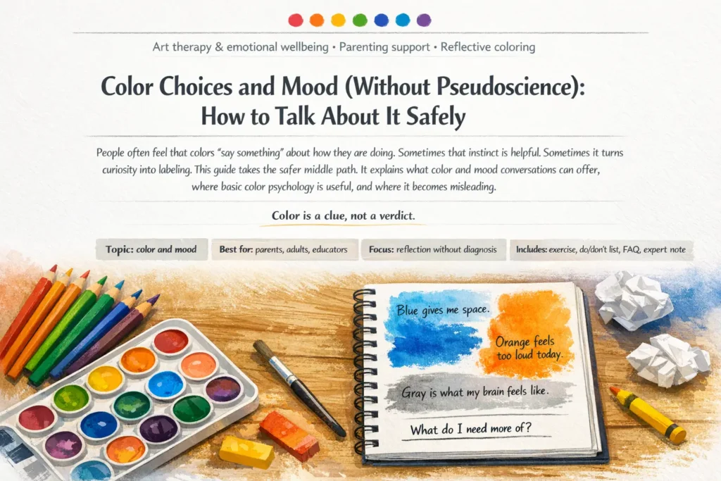
Exercise: “3 colors today” + one-sentence journaling
This exercise is intentionally small. People usually reflect more honestly when the task is short enough to finish. The aim is not to create a beautiful page. The aim is to notice emotional tone without overexplaining it.
This format works for both children and adults because it separates observation from judgment. A child can say, “Red is my after-school body,” and that can be enough. An adult can write, “Blue is the only color that doesn’t crowd me today,” and that can be enough too. In both cases, the exercise supports emotional literacy by making feelings easier to name.
Over time, reflective journaling with art may reveal patterns worth noticing: school mornings may lean toward sharper contrast, weekends toward softer blends, stressful seasons toward fewer colors, or recovery periods toward more blank space. The key point is that the pattern belongs to the person. It does not come from a rigid myth about what colors are supposed to mean.
Cultural and personal differences in color meaning
One of the biggest mistakes in popular color advice is treating symbolism as universal. It is not. Cultural meanings shift. Family habits matter. Religious traditions matter. Design trends matter. Memory matters. A color that suggests celebration in one setting may suggest caution, mourning, status, modesty, or institutional routine in another.
Personal history matters just as much. A child who loves the sea may use blue as comfort rather than sadness. Someone who associates hospitals with white may not find white calming at all. Brown may feel grounding to one person and dull to another. Neon tones may feel alive to one nervous system and overwhelming to another. Responsible reflection begins with the person’s own associations before borrowing from any broader framework.
Do not confuse shared associations with universal truth. Even when a pattern is common, it still needs to be checked against personal meaning.
This is especially important in classrooms and multicultural families. If adults talk as though color meanings are fixed, children may start editing their drawings to avoid being misunderstood. That weakens the very thing art can offer: honest, low-pressure expression. Safer language sounds like this: “Many people experience color in different ways. What is it like for you?”
A useful reflective habit is to ask about body and space, not only symbolism. Does the color feel warm or cool in your body? Busy or spacious? Near or far? Protective or exposing? These questions stay closer to lived experience and help meaning emerge without forcing it.
Avoiding harmful interpretations with kids
Children are especially vulnerable to adult certainty. When grown-ups interpret too fast, kids can learn that art is risky: use the “wrong” color and someone will decide what is happening inside you. That is not supportive. It can create shame, defensiveness, or performance. Some children then start drawing what looks acceptable instead of what feels true.
Safer support does not require silence. It requires restraint and better wording. Parents and educators can absolutely use emotions and colors for kids as a conversation starter. The key is to keep the meaning collaborative, flexible, and proportionate.
- Do: ask open questions such as “Tell me about these colors.”
- Do: notice function: “This dark outline looks strong. What is it doing here?”
- Do: allow “I don’t know” or “I just liked it” as a complete answer.
- Do: look for patterns over time, not single pages.
- Do: use color talk to support regulation: “Which colors help you feel steadier?”
- Don’t: announce conclusions like “Black means sadness” or “Red means anger.”
- Don’t: turn every drawing into a mental health test.
- Don’t: pressure children to explain more than they want to explain.
- Don’t: compare siblings’ color choices as though one is healthier than the other.
- Don’t: ignore the larger context if a child seems persistently distressed in daily life.
When to look beyond the page
A single drawing should not be overread. At the same time, art should not be used to dismiss broader concerns. If a child shows persistent changes in sleep, appetite, school participation, emotional regulation, aggression, shutdown, school refusal, sudden withdrawal, or a marked drop in day-to-day functioning, the concern is the pattern in life, not the shade of the marker. Art may help start a conversation, but it should never carry the full weight of conclusion on its own.
The healthiest approach is often the simplest: stay curious, stay calm, and let the child’s own meaning lead. When color becomes a bridge rather than a verdict, it supports trust. And trust is usually more helpful than any symbolic theory.
Closing thought
Color can absolutely become part of reflective practice. It can help adults slow down, help children name experience, and help families talk about mood without forcing adult-level explanations. But the safest, most useful question is rarely “What does this color mean?” It is: “What does this color mean here, for this person, today?”
That question leaves room for nuance, memory, culture, mood, art prompts, and honest uncertainty. It keeps color in its best role: not as pseudoscience, but as a gentle tool for attention, language, and care.
FAQ
Does one color always mean one emotion?
No. Some broad color-emotion associations are common, but they are not universal. Meaning depends on context, culture, memory, personal history, and the role that color plays in the image.
Can parents use color choices to understand a child’s mood?
Yes, but only as a conversation starter. Color can help a child describe experience, but it should not be treated as proof of a mental state or as a shortcut to diagnosis.
Is dark coloring a sign of trauma or depression?
Not by itself. Dark tones may reflect contrast, style, protection, mood, or simple preference. Concern should be based on broader life patterns such as withdrawal, school refusal, sleep change, or loss of functioning, not on one drawing alone.
What is a safe question to ask after a child finishes coloring?
A safe option is: “Tell me about the colors you chose.” That keeps the conversation open and allows the child to confirm, reject, or reshape the meaning in their own words.
How can adults use color for reflection without overthinking it?
A simple method is the “3 colors today” exercise: choose three colors, place them on the page, and write one sentence about what each one does or feels like today. This supports reflection without forcing rigid symbolism.
Where can I go next on Mimi Panda?
A natural next step is to explore coloring journaling prompts and mindfulness coloring, where color can be used in a more structured reflective practice.
Expert Assessment: When Adults Turn Color Into a Verdict
Why children often stop sharing when adults interpret too fast
Children usually come to drawing for relief, play, control, or expression. When an adult immediately translates color into a fixed emotional judgment, the child may stop using art honestly. The problem is not only accuracy. It is psychological safety. A child who feels watched too closely may begin to manage the adult rather than express the self. That is why careful adults do not rush toward hidden meaning.
What helps more than symbolic certainty
The most supportive response is descriptive, not dramatic. “I notice you used strong dark lines,” “This part looks crowded,” or “You chose only three colors today” are safer openings than “This means you are angry.” Description gives the child room to confirm, reject, or reshape the meaning. That protects dignity and supports emotional language instead of replacing it.
Two common mistakes parents make
- Turning one page into a conclusion. A single drawing may reflect mood, habit, play, aesthetics, or available materials. It does not carry enough information to support a firm interpretation.
- Asking leading questions. Questions like “Are you sad?” or “Why is it all black?” can narrow the child’s answer and create shame. Open prompts work better.
When parents should look beyond the page
If parents are worried, they should look first at life patterns: sleep, appetite, fearfulness, shutdown, aggressive behavior, school refusal, sudden withdrawal, or major changes in functioning. A drawing may become one small entry point into conversation, but it should not carry the weight of conclusion on its own. In healthy support, art is a bridge into relationship. It is not a courtroom exhibit.