In the world of art and design, color is one of the most powerful tools at an artist’s or designer’s disposal. It has the ability to evoke emotions, capture attention, and convey meaning without the need for words. Among the various ways to use color effectively, the concept of complementary colors stands out as particularly impactful. Complementary colors are pairs of colors that, when placed next to each other, create a vibrant contrast that can enhance visual interest and direct the viewer’s gaze. At the same time, these colors can be used to create harmony when carefully balanced. This article explores how to harness the power of complementary colors to create both contrast and harmony in various creative projects.
Table of Contents
Understanding Complementary Colors
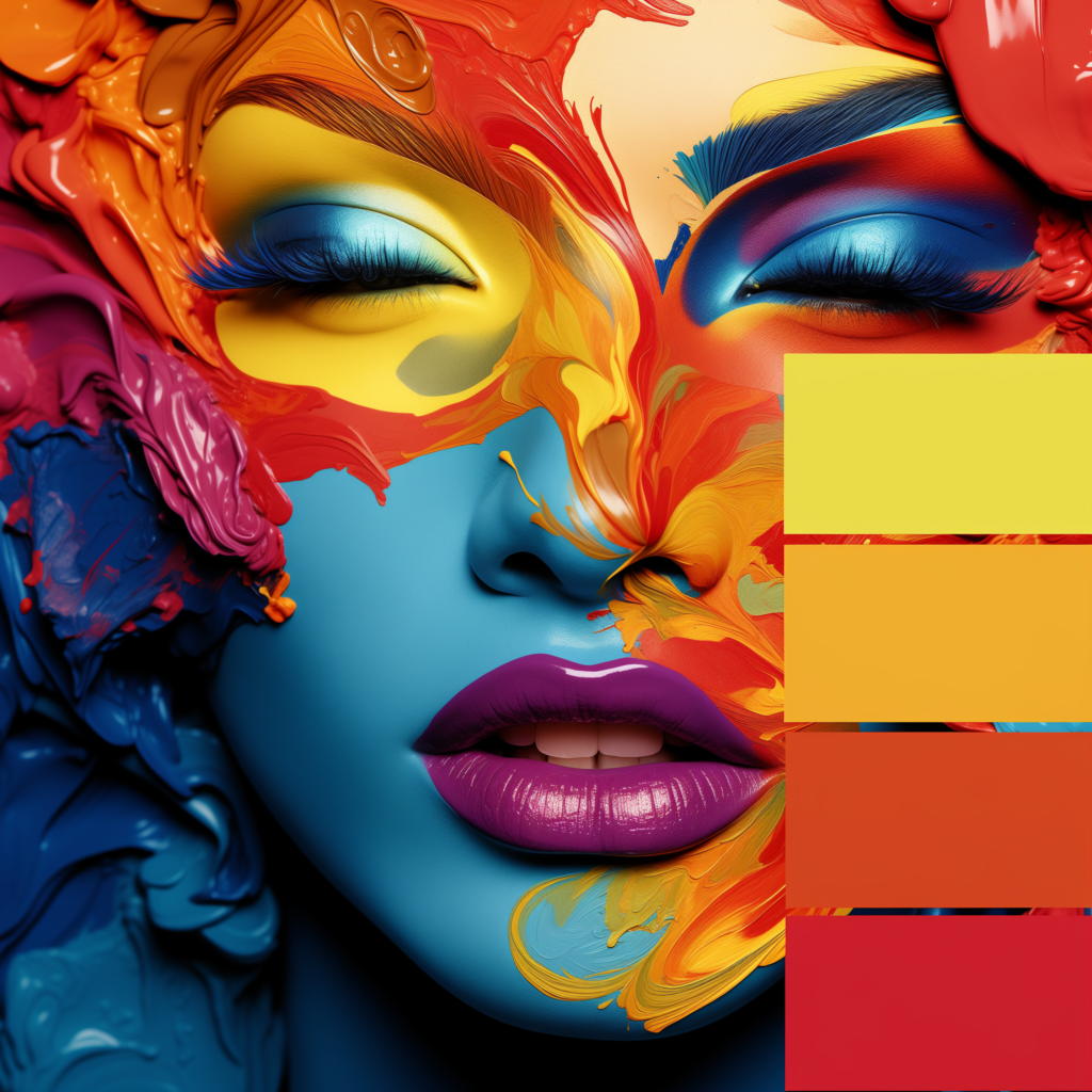
Complementary colors are colors that sit directly opposite each other on the color wheel. This positioning is no coincidence; it’s a result of the way light and color interact. When these colors are placed side by side, they create the strongest possible contrast, making each color appear more vivid and intense. For example, the complementary pair of red and green is one of the most well-known, often seen in holiday decorations, but it can also be used to great effect in art and design to create dynamic compositions.
The Basics of the Color Wheel
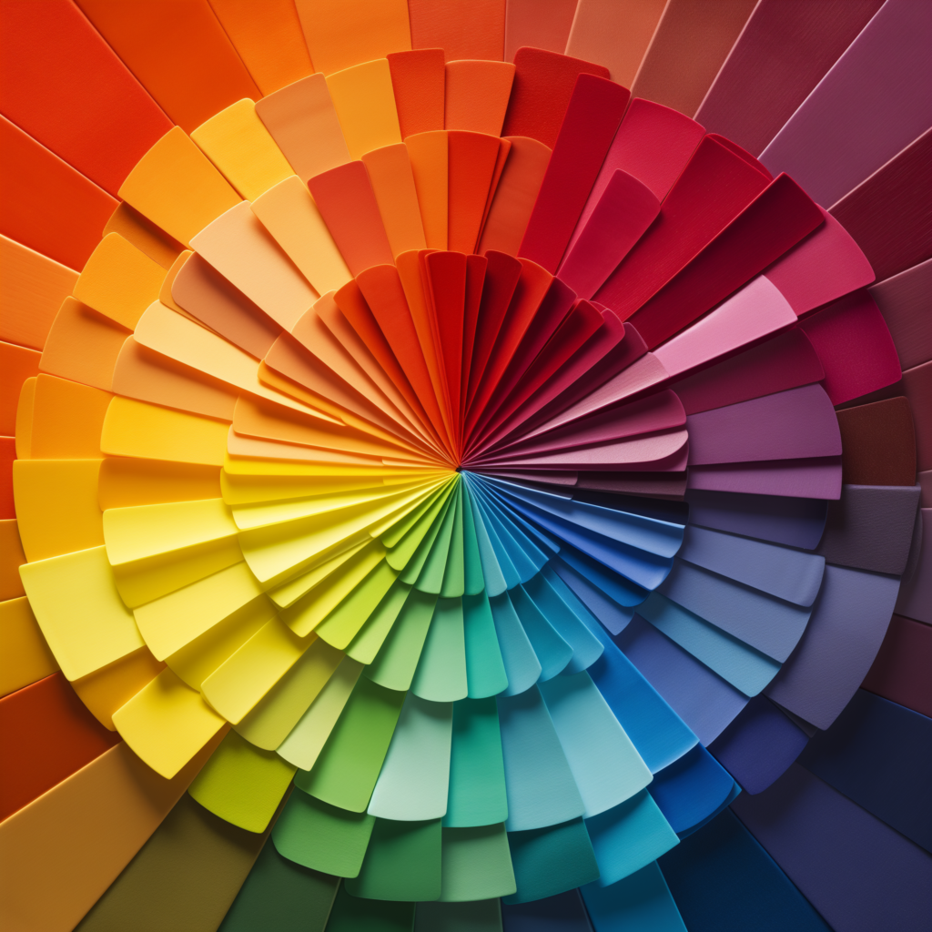
The color wheel, first conceptualized by Sir Isaac Newton in the 17th century, is a circular diagram that shows the relationships between different colors. The wheel is typically divided into primary colors (red, blue, yellow), secondary colors (orange, green, purple), which are made by mixing the primary colors, and tertiary colors, which are a blend of primary and secondary colors. Complementary colors are found by drawing a straight line from one color directly across the wheel to its opposite. For instance, the complementary color of blue is orange, while the complementary color of yellow is purple.
The Psychological Impact of Complementary Colors
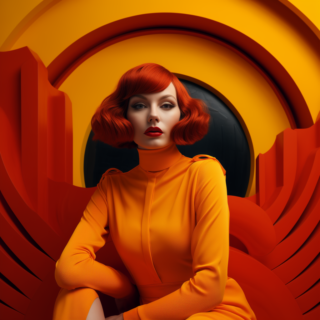
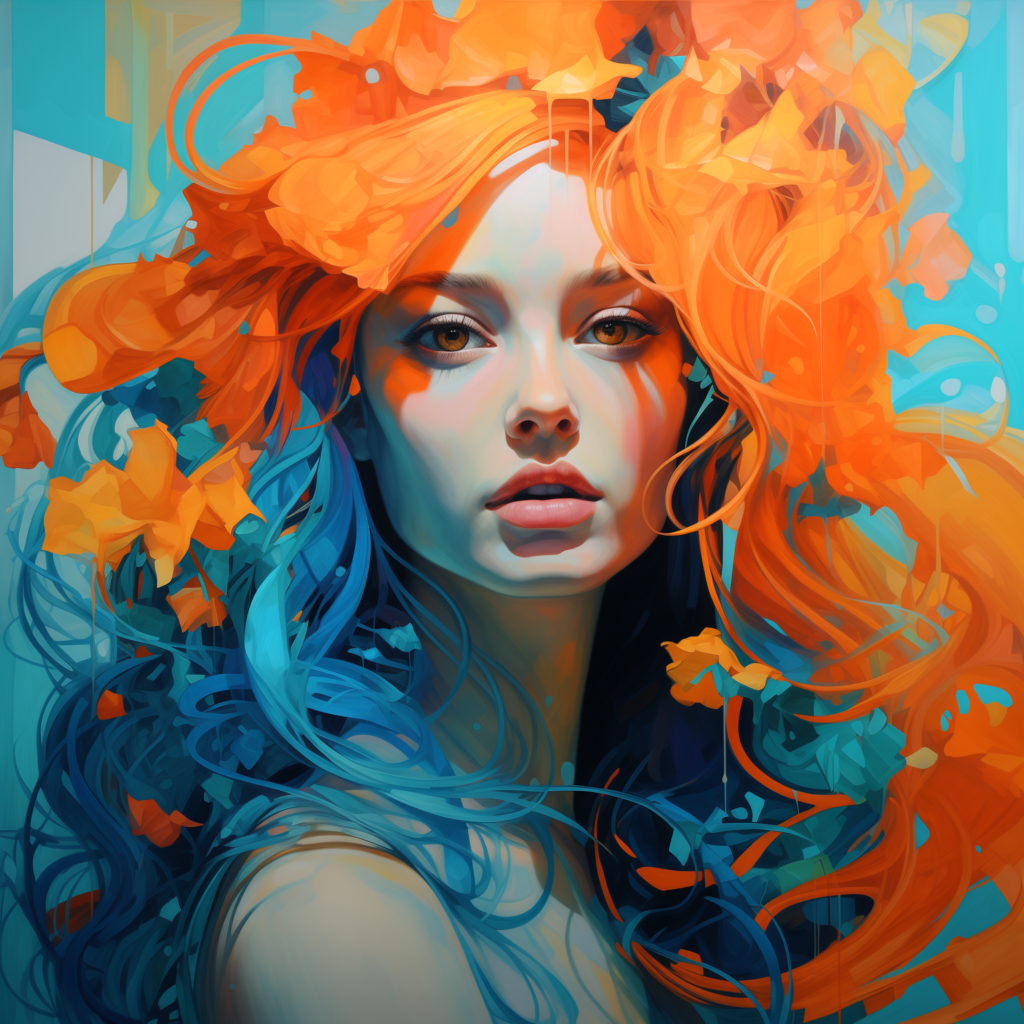
Complementary colors don’t just create visual contrast; they also have a significant impact on how we feel and perceive a design. Different complementary pairs evoke different emotions and reactions. For example, the red-green combination is often associated with energy and vibrancy, which is why it’s so effective in designs that need to grab attention quickly. On the other hand, the blue-orange combination is often seen as more balanced, combining the calmness of blue with the warmth of orange to create a sense of both stability and creativity.
Creating Visual Contrast with Complementary Colors
One of the most common uses of complementary colors is to create striking visual contrasts. This technique is widely used in art, design, and advertising to draw attention to specific elements of a composition. When complementary colors are placed next to each other, the contrast is so strong that it immediately catches the eye, making it an excellent tool for highlighting important details or creating a focal point.
Complementary Colors in Art
Artists have long used complementary colors to create drama and depth in their work. For example, Vincent van Gogh frequently employed complementary color schemes to intensify the emotional impact of his paintings. In The Night Café, Van Gogh used red and green to create a jarring, unsettling atmosphere that reflects the oppressive mood of the scene. The strong contrast between these colors adds to the emotional intensity, making the painting more powerful and engaging.
Complementary Colors in Design
In design, complementary colors are often used to create bold, eye-catching visuals. Whether in graphic design, web design, or interior design, complementary color schemes can make a design stand out. For instance, in branding, using complementary colors can help a logo or product packaging pop, making it more memorable to consumers. Designers often use complementary colors to create contrast between text and background, ensuring that important information is easily readable and attention-grabbing.
Achieving Harmony with Complementary Colors
While complementary colors are often used for contrast, they can also be used to create harmony when handled with care. Achieving harmony involves balancing the intensity of complementary colors to ensure they work together cohesively rather than clashing. This can be done by adjusting the saturation, tint, and shade of the colors.
Blending and Mixing Complementary Colors
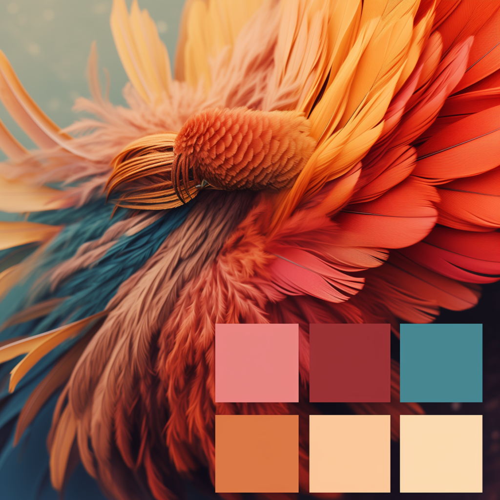
Blending complementary colors can create neutral tones and subtle transitions, which are particularly useful in painting and digital art. When complementary colors are mixed, they neutralize each other, resulting in a more muted, harmonious tone. For example, mixing red and green can create a range of browns and grays, which can be used to soften the overall contrast and create a more cohesive look. This technique is especially useful in creating realistic shadows and highlights in art, as it allows for a more natural progression of colors.
Creating Harmonious Color Palettes
When developing a color palette, complementary colors can be used to create a balanced and harmonious scheme. The key is to avoid using both colors in their purest, most saturated forms, as this can be overwhelming. Instead, consider using one color as the dominant hue and the other as an accent. For example, in a blue-orange palette, you might choose a muted blue for the background and use a bright orange for smaller, focal elements. This approach creates harmony by ensuring that the colors complement rather than compete with each other.
Complementary Colors in Different Art Forms
Complementary colors are used across various art forms to enhance visual storytelling and create emotional impact. Whether in painting, photography, or digital art, these color pairs can bring a composition to life by adding depth, contrast, and balance.
Complementary Colors in Photography
Photographers often use complementary colors to create striking compositions that draw the viewer’s eye. In landscape photography, the contrast between a blue sky and an orange sunset can create a breathtaking image. Similarly, in portrait photography, using complementary colors in the background or clothing can make the subject stand out more clearly. By carefully selecting and positioning complementary colors, photographers can guide the viewer’s attention and enhance the overall impact of the image.

Complementary Colors in Digital Art
In digital art and animation, complementary colors are used to create dynamic, visually engaging scenes. Digital artists have the advantage of being able to experiment with a wide range of color combinations and adjustments. For example, in video game design, complementary colors can be used to differentiate between characters and backgrounds, ensuring that key elements stand out. This technique is also used in user interface design to highlight important buttons or information, guiding users intuitively through digital spaces.
The Role of Complementary Colors in Branding and Marketing
In branding and marketing, complementary colors are often used to create a strong, memorable identity. Brands use these colors to evoke specific emotions and connect with their target audience on a psychological level. For example, the combination of red and green is commonly used in the food industry to stimulate appetite and convey freshness. Meanwhile, the blue-orange combination is often used by tech companies to convey innovation and reliability.
The Psychological Effects of Complementary Colors in Consumer Behavior
Complementary colors can influence consumer behavior by creating a sense of excitement or calm, depending on the context. In retail design, for example, using complementary colors in signage or product displays can make certain items more appealing and increase the likelihood of a purchase. In advertising, the contrast created by complementary colors can help a product stand out in a crowded market, making it more likely to be noticed by potential customers.
Common Mistakes to Avoid When Using Complementary Colors
While complementary colors can be incredibly effective, they need to be used carefully to avoid common pitfalls. One mistake is overusing complementary colors, which can lead to visual clutter and overwhelm the viewer. Another mistake is failing to balance the intensity of the colors, resulting in harsh contrasts that detract from the overall composition. To avoid these issues, it’s important to consider the context in which the colors will be used and to experiment with different combinations to find the right balance.
Conclusion
Complementary colors are a powerful tool in the world of art and design, offering endless possibilities for creating contrast and harmony. By understanding how these colors interact and affect perception, you can use them to enhance your creative projects and make a lasting impact. Whether you’re an artist, designer, or simply someone interested in the power of color, experimenting with complementary color schemes can open up new avenues for expression and innovation.
Mastering the use of complementary colors can elevate your work, helping you to create visuals that are not only striking but also balanced and harmonious. So, the next time you sit down to create, consider how complementary colors can work together to bring your vision to life.
FAQs
While complementary colors are effective in creating contrast, using them in large areas can be overwhelming. It’s often better to use one color as the dominant hue and the other as an accent.
To create balance, adjust the saturation, tint, and shade of the complementary colors, and use one color more dominantly with the other as an accent to avoid overwhelming the viewer.
Complementary colors create a vivid contrast that draws attention and can evoke specific emotional responses, making them a powerful tool in visual communication.
Complementary colors are pairs of colors that are opposite each other on the color wheel. They create strong visual contrast and can be used to enhance visual interest and convey emotions in art and design.
Contrast refers to the visual tension created by the use of complementary colors, while harmony involves balancing these colors to create a cohesive and pleasing composition.