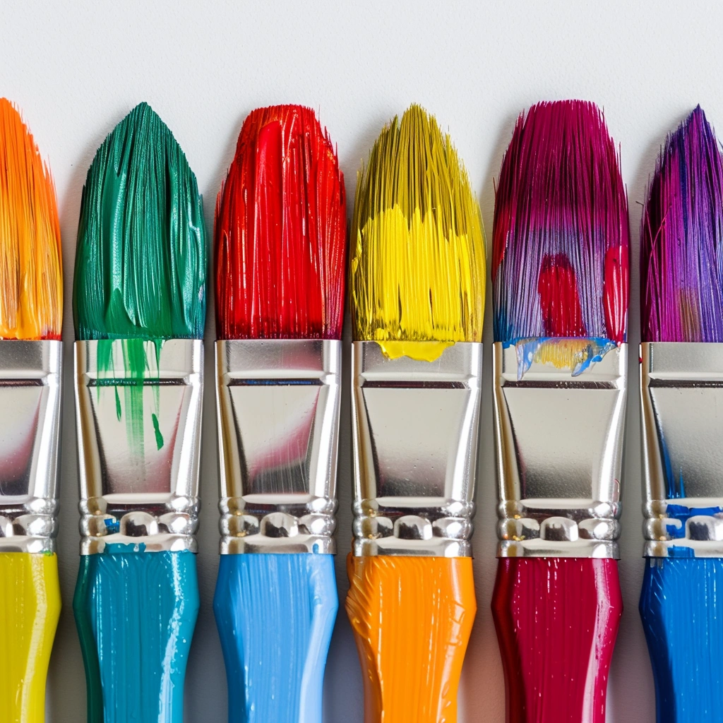
Colors are everywhere—they shape our perceptions, influence our moods, and guide our decisions. Whether you’re designing a brand, decorating your home, or creating a website, choosing the right color palette is critical. The field of color psychology explores how colors impact human emotions and behaviors, offering valuable insights to help you make the best choices for any project.
Table of Contents
Understanding Color Psychology
What is Color Psychology?
Color psychology studies how colors affect human thoughts, feelings, and actions. It’s a blend of science and art, rooted in how our brains process color and its associated meanings.
How Colors Influence Emotions and Behavior
Different colors can evoke specific emotions. For example, red stimulates excitement and urgency, while blue promotes calmness and trust. These effects are both instinctive and culturally learned.
The Science Behind Color Perception
Our perception of color depends on light, context, and individual experiences. This complex interaction means the same color can evoke different reactions in different people.
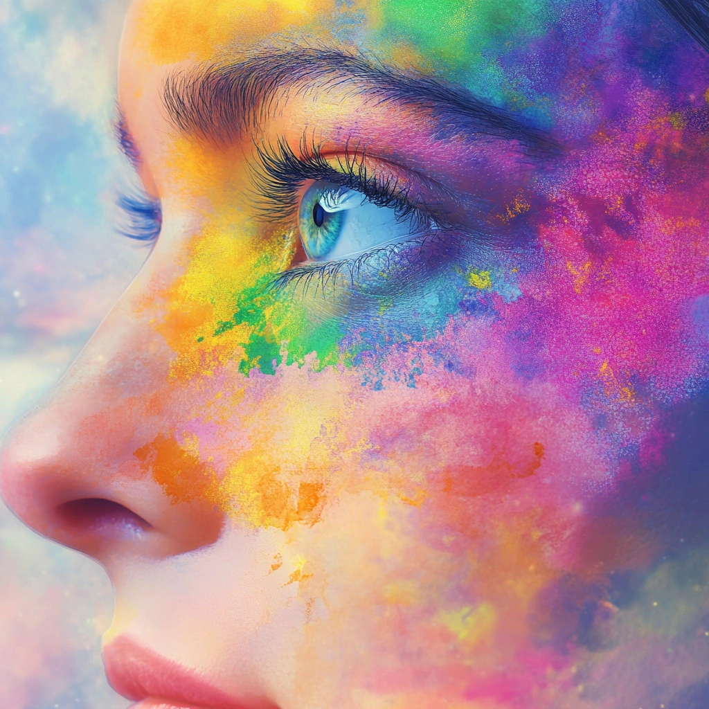
The Impact of Colors on Emotions
Warm Colors and Their Effects
Colors like red, orange, and yellow are warm tones that evoke feelings of energy, passion, and happiness. They’re excellent for grabbing attention but can also feel overwhelming in excess.
Cool Colors and Their Soothing Qualities
Blue, green, and purple are calming colors often associated with tranquility and relaxation. They’re ideal for creating serene environments or establishing trust in branding.
Neutral Tones and Their Versatility
Neutral shades like beige, gray, and white provide balance and serve as a canvas for other colors. They’re versatile choices in both design and decor.
Factors to Consider When Choosing a Color Palette
Purpose of the Project
Are you designing a logo, painting a room, or creating a website? The function of your project will dictate the ideal colors.
Target Audience Preferences
Consider who you’re designing for. Age, gender, and cultural background can significantly influence color preferences and perceptions.
Cultural Significance of Colors
Colors carry different meanings across cultures. For example, white symbolizes purity in Western societies but may represent mourning in some Eastern cultures.
Colors and Their Psychological Associations
- Red: Associated with passion, energy, and urgency. It’s often used in sales and warning signs.
- Blue: Represents calmness, trust, and reliability, commonly seen in corporate and healthcare branding.
- Yellow: Evokes happiness and optimism but can also signal caution in certain contexts.
- Green: Symbolizes growth, balance, and nature, making it popular in eco-friendly and wellness designs.
- Black: Conveys elegance, power, and sophistication but can also suggest mystery or mourning.
- White: Reflects simplicity, purity, and clarity, often used in minimalist and modern designs.
How Color Choices Affect Branding
Establishing Brand Identity Through Color
Your brand’s color palette sets the tone for its identity. Companies like Coca-Cola use red for excitement, while Facebook uses blue for trustworthiness.
Building Emotional Connections with Consumers
Colors can evoke specific emotions that align with your brand message. For instance, green brands convey eco-consciousness.
Case Studies of Successful Color Usage in Branding
Brands like McDonald’s (red and yellow) capitalize on appetite stimulation, while Tiffany & Co. uses its signature blue to denote luxury and exclusivity.
The Role of Color in Interior Design
Creating Moods for Different Rooms
Colors have a profound impact on the atmosphere of a room. Warm tones like red and orange create a sense of intimacy and energy, making them ideal for living rooms and dining areas. Cool tones such as blue and green are more suited for bedrooms and bathrooms, as they promote relaxation and calmness.
Balancing Light and Space with Color
Lighter shades can make a room feel more spacious and airy, while darker colors add coziness and depth. Strategic use of colors can help balance the natural and artificial light in a room, enhancing its overall ambiance.
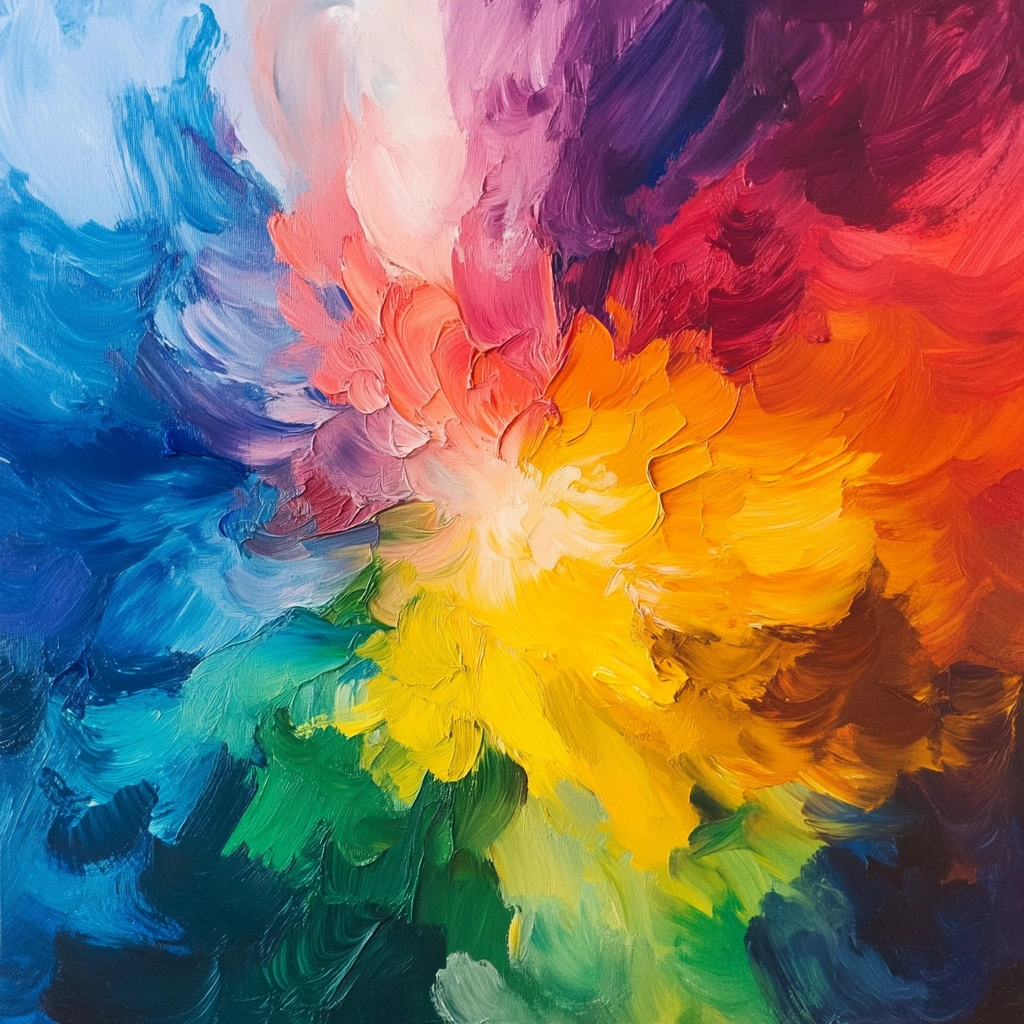
Combining Colors for Harmony and Contrast
A well-designed palette balances harmony and contrast. For example, pairing complementary colors like blue and orange creates vibrant contrast, while analogous colors such as blue and green provide a more seamless blend.
The Role of Color in Digital Design
Enhancing User Experience Through Color
In digital design, colors guide users’ attention and influence their interactions. For example, red is often used for call-to-action buttons to encourage quick responses, while soft blues create a calming user interface.
Accessibility and Color Contrast Considerations
Accessibility is critical in digital design. High contrast between text and background ensures readability for all users, including those with visual impairments.
Popular Trends in Digital Color Palettes
Modern web design leans toward minimalist palettes with soft pastels or bold, vibrant gradients. Monochromatic schemes are also gaining popularity for their clean, sophisticated look.
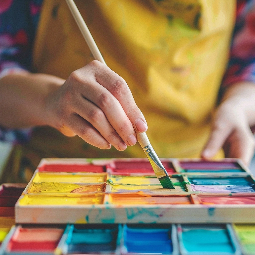
Tools and Resources for Choosing a Palette
Color Theory Basics
Understanding the fundamentals of color theory, including the color wheel and relationships like complementary, analogous, and triadic colors, is essential for creating balanced palettes.
Online Color Palette Generators
Web tools like Coolors, Adobe Color, and Canva simplify the process of creating and testing palettes. They allow you to experiment with combinations and visualize them in real time.
Using the Color Wheel Effectively
The color wheel is an indispensable tool for designers. It helps you identify harmonious pairings and contrasts, ensuring your palette aligns with your design goals.
Tips for Choosing the Perfect Palette
Start with a Dominant Color
Choose a primary color that reflects the core emotion or purpose of your project. For example, blue for trust or red for energy.
Choose Complementary and Accent Colors
Select secondary colors that complement your dominant shade. Accent colors add interest and are often used for highlights or specific design elements.
Test Your Palette in Different Environments
Colors can appear differently under varying lighting conditions or screen settings. Always test your palette in real-world or digital environments before finalizing it.
Mistakes to Avoid When Choosing Colors
Overusing Bright or Bold Colors
While bright colors attract attention, overusing them can overwhelm the viewer. Balance bold hues with neutral tones for a more cohesive design.
Ignoring Cultural Differences
Be mindful of how colors are perceived in different cultures. For instance, white may symbolize purity in some regions but mourning in others.
Failing to Consider Color Harmony
Choosing colors that clash or lack cohesion can undermine your design’s effectiveness. Rely on tools and principles like the color wheel to ensure harmony.
Color Trends in Modern Design
Popular Color Palettes in 2025
Earthy tones, soft pastels, and vibrant neons dominate 2025’s design trends, reflecting themes of sustainability, nostalgia, and bold expression.
Influences of Minimalism and Maximalism
Minimalist palettes focus on simplicity and clarity, often using monochromatic schemes or soft neutrals. Maximalist designs embrace eclectic, vibrant combinations that evoke energy and personality.
Sustainable and Nature-Inspired Palettes
Palettes inspired by nature, such as forest greens, ocean blues, and sandy beiges, are increasingly popular due to their calming and eco-conscious appeal.
The Future of Color Psychology
Advances in Color Science and Technology
Ongoing research into color perception and its psychological effects is uncovering new insights, allowing designers to use colors more effectively.
AI and Personalized Color Recommendations
AI-powered tools can analyze user preferences and suggest personalized palettes, making color selection more intuitive and tailored.
Emerging Trends in Emotional Design
As emotional design gains traction, colors will play an even more significant role in creating meaningful, user-centric experiences.
Conclusion
Color psychology is a powerful tool that shapes how we perceive and interact with the world. Whether you’re building a brand, designing a home, or crafting a digital interface, understanding the psychological impact of colors can help you make informed choices. By leveraging the principles of color theory, avoiding common mistakes, and staying updated on trends, you can create impactful designs that resonate with your audience.